Thank you!
A big thank you to everyone who attended my sessions at the SoCal Code Camp. I had a great time, and I hope that all of you did, too.
As a reminder, for all of my sessions: the slides, code samples, and walkthroughs are available here: http://www.jeremybytes.com/Demos.aspx.
Drop me a note if you had a chance to attend. I'd love to hear what you thought.
Sunday, January 31, 2010


Sunday, January 10, 2010
Introduction to XAML with WPF
(Editor's note: I will be presenting this topic at the SoCal Code Camp Jan 30 & 31, 2010.)
Overview
Understanding XAML (eXtensible Application Markup Language) is a key to creating the latest .NET user experiences in WPF and Silverlight. We will introduce the basic concepts around XAML and take a look at various features such as namespaces, elements, properties, events, attached properties and some basic layout. We’ll create a simple WPF application that covers these fundamentals. Although you will probably end up doing most of your UI design with a drag-and-drop tool such as Expression Blend, knowing the internals gives you a leg up in making the final tweaks to ensure an excellent user experience.
Get It Here
As mentioned in a previous post, the demos are now available in PDF form here: http://www.jeremybytes.com/Demos.aspx.
Direct Links:
PDF Walkthrough
Code Download
Happy coding!
Overview
Understanding XAML (eXtensible Application Markup Language) is a key to creating the latest .NET user experiences in WPF and Silverlight. We will introduce the basic concepts around XAML and take a look at various features such as namespaces, elements, properties, events, attached properties and some basic layout. We’ll create a simple WPF application that covers these fundamentals. Although you will probably end up doing most of your UI design with a drag-and-drop tool such as Expression Blend, knowing the internals gives you a leg up in making the final tweaks to ensure an excellent user experience.
Get It Here
As mentioned in a previous post, the demos are now available in PDF form here: http://www.jeremybytes.com/Demos.aspx.
Direct Links:
PDF Walkthrough
Code Download
Happy coding!
Monday, January 4, 2010
Introduction to Data Templates and Value Converters in Silverlight 3
(Editor's note: I will be presenting this topic at the SoCal Code Camp Jan 30 & 31, 2010.)
Overview
Business applications are all about data, and laying out that data is critical to creating a good user experience. Fortunately, Silverlight 3 has several tools, including Data Templates and Value Converters, that make this easier for the business application developer to manage. Today, we'll take a look at consuming a WCF service and creating the layout of the data. By the time we're done, you should have a good understanding of the basics of Data Templates and Value Converters.
Get It Here
As mentioned in a previous post, the demos are now available in PDF form here: http://www.jeremybytes.com/Demos.aspx.
Here's some direct links:
PDF Walkthough
Code Download
Happy coding!
Overview
Business applications are all about data, and laying out that data is critical to creating a good user experience. Fortunately, Silverlight 3 has several tools, including Data Templates and Value Converters, that make this easier for the business application developer to manage. Today, we'll take a look at consuming a WCF service and creating the layout of the data. By the time we're done, you should have a good understanding of the basics of Data Templates and Value Converters.
Get It Here
As mentioned in a previous post, the demos are now available in PDF form here: http://www.jeremybytes.com/Demos.aspx.
Here's some direct links:
PDF Walkthough
Code Download
Happy coding!
Friday, January 1, 2010
More Demos Coming
A New Direction
Okay, so I've posted several demo articles here so far. The unfortunate thing is that the blogging tool I've been using is not the easiest thing to use for these demos. One of the primary shortcomings is the inability to have code samples that can easily be copy/pasted. With this in mind, I've decided to post upcoming demos as PDFs (along with downloadable code samples). I think this should improve usability for me and my readers.
You can get the PDFs and code samples here: http://www.jeremybytes.com/Demos.aspx.
If you miss the HTML walkthroughs and really want to see them again, just post me a message at feedback@jeremybytes.com, and I'll see what I can do for future articles.
Okay, so I've posted several demo articles here so far. The unfortunate thing is that the blogging tool I've been using is not the easiest thing to use for these demos. One of the primary shortcomings is the inability to have code samples that can easily be copy/pasted. With this in mind, I've decided to post upcoming demos as PDFs (along with downloadable code samples). I think this should improve usability for me and my readers.
You can get the PDFs and code samples here: http://www.jeremybytes.com/Demos.aspx.
If you miss the HTML walkthroughs and really want to see them again, just post me a message at feedback@jeremybytes.com, and I'll see what I can do for future articles.
Thursday, December 31, 2009
Introduction to the Background Worker Component in WPF
(Editor's Note: An updated and expanded version of this article is available for download: Keep Your UI Responsive with the Background Worker Component)
The Problem
We've all experienced it: the application UI that hangs. You get the dreaded "Not Responding" message, and you have to decide if you should wait it out or simply kill the process. If you have long-running processes in your application, you should consider putting them on a separate thread so that your UI remains responsive. However, threading is a daunting subject. We've heard horror stories about race conditions and deadlocks, and needing to use the thread dispatcher to communicate between background threads and UI threads. At this point, it sounds like a subject best left to the experts.
The Solution
Fortunately, the .NET framework provides a simple way to get started in threading with the BackgroundWorker component. This wraps much of the complexity between your background thread and your UI thread without doing any special coding. You can use this component with WinForms and WPF applications. We'll be using it with WPF here.
The BackgroundWorker offers several features which include spawning a background thread, the ability to cancel the background process before it has completed, and the chance to report the progress back to your UI. We'll be looking at all of these features.
The Set Up
We'll start with a fairly simple WPF application that has a long-running process that blocks the application until it has completed. You can download the source code for the application here: http://www.jeremybytes.com/Downloads.aspx. The download includes the starter application and the completed code. The starter application includes the following.
1. A Simple WPF form:

You can find the XAML for this in the download. It consists of 2 Text Boxes (Iterations and Output), a Progress Bar, and 2 Buttons (Start and Cancel).
2. A long-running process (in the code-behind the form):
(click image to enlarge)

You can see that we're using the famously slow process Sleep(100) that loops based on the parameter value.
3. Event-handlers for the buttons (in the code-behind):
(click image to enlarge)

When you run the application and click the Start button, you'll see that the application hangs until the process is finished. If you try to move or resize the window while the process is running, nothing will happen for several seconds. And you'll see the "Not Responding" message if you look in Task Manager:

When the process is completed, you will see the value from the Iterations box mirrored in the Output box. This is simply a confirmation that the process completed. You can try this with different values. Since we are using a Sleep(100), a value of 50 iterations will translate into a 5 second process; a value of 100 is 10 seconds, and so on. Just as a side note, I chose a value of 1/10th of a second for the Sleep rather than the usual 1 second so that we will have a smoother progress update later on.
Adding the BackgroundWorker
The BackgroundWorker is a non-visual component. In the WinForms world, this would mean that we could just drag the BackgroundWorker from the Tool Box onto the Form, and it would show up as a non-visual component. In WPF, things are a little bit different. We need to add the BackgroundWorker as a window resource that we can reference throughout our code. Here's the steps:
1. Add the System.ComponentModel namespace to the XAML. We do this in the markup for the Window. The good news is that Visual Studio IntelliSense helps you out quite a bit with this. We'll give the namespace a "cm" alias so we can reference it easily. Here's the Window markup with the namespace included:
(click image to enlarge)

2. Add a BackgroundWorker as a Window Resource.
(click image to enlarge)

Hooking Things Up
To use the basic functionality of the BackgroundWorker, we need to do a couple of things. First, we need to hook up two event handlers: DoWork and RunWorkerCompleted. These events are much like they sound. To kick off the background process we call the RunWorkerAsync method of the BackgroundWorker and pass any parameters needed. This fires the DoWork event (which is where we'll put our long-running process). The RunWorkerCompleted event fires after that process is done. At that point, we can update our UI and do clean up (if required).
So, let's put our process into the background. We'll start by creating the handlers for the events mentioned above. As a reminder, Visual Studio IntelliSense helps us out quite a bit with this. In our BackgroundWorker markup that we created above, just type "DoWork=" and you'll get the option for "New Event Handler". This will create the stub and give the handler a name based on our component. We'll do the same for "RunWorkerCompleted" and end up with the following XAML:
(click image to enlarge)

Now we'll flip over to the code-behind and implement these handlers. Let's look at the code, then we'll talk through it. Note, in addition to the code below, I have also added a "using System.ComponentModel;" to make things a little less verbose:
(click image to enlarge)

First, you'll see that our DoWork event calls the DoSlowProcess method (our long-running process). You'll note that we are getting an integer argument from the DoWorkEventArgs (we'll see how this gets passed in just a minute). The e.Argument is of type Object, so we have to cast it to the integer type that our method is expecting. Next, you'll note that we're passing the result back to the DoWorkEventArgs in e.Result. This will be used in the next handler.
The RunWorkerCompleted event fires after the long-running process is complete. You can see that the first thing we do is check to see if an error occurred. If not, then we'll go ahead and populate the output box with the result of our method. The e.Result here is actually the same e.Result from the DoWork event. In our case, the DoSlowProcess returns an integer that we populate in the output. In addition, you can see that we are enabling and disabling the buttons as appropriate.
The important thing is what you don't see. Notice that our completed handler is manipulating our UI elements without any use of the Dispatcher or Invoke methods that you need to do if you are handling the threading on your own. Instead, we just reference the elements on the UI thread directly. The BackgroundWorker takes care of all of the complexity on the back end.
Finally, we need to kick off the DoWork event in our Start Button handler. In order to do this, we need a reference to the BackgroundWorker component in our window. The problem is that it is simply a resource right now. The first task is to get a reference to it. We'll put this code at the top of our Window class and modify the constructor:
(click image to enlarge)

In this code, you see that we create a private variable to reference the BackgroundWorker component. Then in the constructor, we pull the component out of the resources by using the FindResource method. Now we can use the component in our code.
Here's our updated code in the Start Button Click event handler:
(click image to enlarge)

You'll notice that instead of calling the DoSlowProcess directly, we are now calling the RunWorkerAsync method of the BackgroundWorker. This method takes an optional object parameter. In our case, we will use this to pass the number of iterations through. This is the value that shows up in the e.Argument of the DoWork handler that we saw above.
The next thing we do is update the button states appropriately. Since the Cancel button is not yet implemented, it won't have too much effect. But we'll get to that in a bit.
Finally, note that we are clearing the output text. Remember that since we are running the process in the background, our UI still remains responsive. We want to clear out the output while the process is running, and then populate it agian after the process is complete. This is handled by the RunWorkerCompleted event that we saw above.
Now we have a fully-functional application with a background process. If you run the application now, you'll notice different behavior from what we saw before. After you click the Start button, the UI remains responsive: you can move and resize the window, type in the boxes, or whatever. When the process if finished, the output box is updated.
But we're not done yet. We still need to look at the Cancel and Progress functions.
Updating Progress
Next we'll look at reporting progress back from our long-running process. One thing to keep in mind if you want to have a progress bar in your UI: you will need to come up with some type of metric for the percent complete. For example, I have used the BackgroundWorker for long-running SQL queries. In this case, I was unable to report percentage because I had no idea exactly how long the process would take. In our sample here, we can use some fairly simple math to report the percentage completed.
The BackgroundWorker has a property we need to set (WorkerReportsProgress) and an event handler (ProgressChanged). These are fairly straight forward to implement. But here's where things get a little complicated. We need to update the progress in our DoSlowProcess method. This means that we need a reference to the BackgroundWorker.
Let's start with the easy parts. First the updated XAML:
(click image to enlarge)

Here we just set the WorkerReportsProgress to True (the default is False) and add the stub for the ProgressChanged event handler. As we did above, we'll just let Visual Studio create a New Event Handlerfor us.
To implement the event handler, we'll just set the value of the progress in our UI:
(click image to enlarge)

Now we'll make updates to some of our existing code. First, the DoSlowProcess method:
(click image to enlarge)

We've added both BackgroundWorker and DoWorkEventArgs parameters to the DoSlowProcess method. In order to update the progress, we'll add some code to each iteration of the loop. First, we check to make sure that the BackgroundWorker parameter was populated; then we check the WorkerReportsProgress property to see if the BackgroundWorker reports progress. If false, then we'll skip the code. If true, then we calculate the percentage and call the BackgroundWorker.ReportProgress method. This will fire the ProgressChanged event that we implemented above.
Now, since we've added additional parameters to DoSlowProcess, we'll need to update the method call. As a reminder, this was in the DoWork event. Here's the updated code:
(click image to enlarge)

We'll just cast the sender to a BackgroundWorker and pass it on through. We'll just pass the DoWorkEventArgs parameter through as well.
Finally, we'll add a line of code to the RunWorkerCompleted event to zero out the progress bar after it has completed:
(click image to enlarge)

The reason for this is if you are using Windows Vista or Windows 7, the progress bar continues to animate even after it is as 100%. This makes it difficult to tell that the progress is complete. So, we'll just set it back to 0 after it's done.

Now, if we run the application again, we'll see that we have a functional progress bar. The last step is to add cancellation.
Before implementing cancellation in your application, you will need to take a few things into consideration. First, when you cancel a BackgroundWorker process, there is no event that fires, and the process does not stop immediately. Instead, a cancellation flag gets set on the BackgroundWorker. It is up to your long-running process to check for this flag and to stop running if necessary. In my example above with the long-running SQL query, I could not implement cancellation because there was no "iteration" in my process -- it was simply waiting for the query to return.
First, we need to set a property on the BackgroundWorker ("WorkerSupportsCancellation"). Then we'll tell the component we want to cancel in the Cancel Button event handler. Next we'll add the cancellation code to our DoSlowProcess method. And finally, we'll make a few changes to the RunWorkerCompleted event handler to behave differently if the process was canceled.
(click image to enlarge)

Next, the Cancel Button event handler:
(click image to enlarge)

You can see that we're simply calling the CancelAsync method of the BackgroundWorker.
(click image to enlarge)

You can see that we added another conditional to check CancellationPending. If so, then we'll set the e.Cancel property of the DoWorkEventArgs and return from our method.
(click image to enlarge)

Here, you can see that we are checking the e.Cancelled property of the EventArgs. If it's true, then we'll put "Canceled" in the output box. One thing you'll note: we are not resetting the progress bar in event of cancellation. This is so that if you stop the process, you can still see how far it got before the cancellation.

Now, when we run the application, we'll see that we have a long-running process that runs in the background (keeping the UI responsive), an updating progress bar, and a working Cancel button.
The BackgroundWorker component allows us to put long-running processes onto a background thread without the usual complexities of threading. We have seen how we can get progress updates that we can show in our UI as well as how to cancel a process before it has completed. In addition, we've seen that even when updating our UI, we don't have to worry about communicating across threads. It is all handled for us in the component.
Happy coding!
The Problem
We've all experienced it: the application UI that hangs. You get the dreaded "Not Responding" message, and you have to decide if you should wait it out or simply kill the process. If you have long-running processes in your application, you should consider putting them on a separate thread so that your UI remains responsive. However, threading is a daunting subject. We've heard horror stories about race conditions and deadlocks, and needing to use the thread dispatcher to communicate between background threads and UI threads. At this point, it sounds like a subject best left to the experts.
The Solution
Fortunately, the .NET framework provides a simple way to get started in threading with the BackgroundWorker component. This wraps much of the complexity between your background thread and your UI thread without doing any special coding. You can use this component with WinForms and WPF applications. We'll be using it with WPF here.
The BackgroundWorker offers several features which include spawning a background thread, the ability to cancel the background process before it has completed, and the chance to report the progress back to your UI. We'll be looking at all of these features.
The Set Up
We'll start with a fairly simple WPF application that has a long-running process that blocks the application until it has completed. You can download the source code for the application here: http://www.jeremybytes.com/Downloads.aspx. The download includes the starter application and the completed code. The starter application includes the following.
1. A Simple WPF form:

You can find the XAML for this in the download. It consists of 2 Text Boxes (Iterations and Output), a Progress Bar, and 2 Buttons (Start and Cancel).
2. A long-running process (in the code-behind the form):
(click image to enlarge)

You can see that we're using the famously slow process Sleep(100) that loops based on the parameter value.
3. Event-handlers for the buttons (in the code-behind):
(click image to enlarge)

When you run the application and click the Start button, you'll see that the application hangs until the process is finished. If you try to move or resize the window while the process is running, nothing will happen for several seconds. And you'll see the "Not Responding" message if you look in Task Manager:

When the process is completed, you will see the value from the Iterations box mirrored in the Output box. This is simply a confirmation that the process completed. You can try this with different values. Since we are using a Sleep(100), a value of 50 iterations will translate into a 5 second process; a value of 100 is 10 seconds, and so on. Just as a side note, I chose a value of 1/10th of a second for the Sleep rather than the usual 1 second so that we will have a smoother progress update later on.
Adding the BackgroundWorker
The BackgroundWorker is a non-visual component. In the WinForms world, this would mean that we could just drag the BackgroundWorker from the Tool Box onto the Form, and it would show up as a non-visual component. In WPF, things are a little bit different. We need to add the BackgroundWorker as a window resource that we can reference throughout our code. Here's the steps:
1. Add the System.ComponentModel namespace to the XAML. We do this in the markup for the Window. The good news is that Visual Studio IntelliSense helps you out quite a bit with this. We'll give the namespace a "cm" alias so we can reference it easily. Here's the Window markup with the namespace included:
(click image to enlarge)

2. Add a BackgroundWorker as a Window Resource.
(click image to enlarge)

Hooking Things Up
To use the basic functionality of the BackgroundWorker, we need to do a couple of things. First, we need to hook up two event handlers: DoWork and RunWorkerCompleted. These events are much like they sound. To kick off the background process we call the RunWorkerAsync method of the BackgroundWorker and pass any parameters needed. This fires the DoWork event (which is where we'll put our long-running process). The RunWorkerCompleted event fires after that process is done. At that point, we can update our UI and do clean up (if required).
So, let's put our process into the background. We'll start by creating the handlers for the events mentioned above. As a reminder, Visual Studio IntelliSense helps us out quite a bit with this. In our BackgroundWorker markup that we created above, just type "DoWork=" and you'll get the option for "New Event Handler
(click image to enlarge)

Now we'll flip over to the code-behind and implement these handlers. Let's look at the code, then we'll talk through it. Note, in addition to the code below, I have also added a "using System.ComponentModel;" to make things a little less verbose:
(click image to enlarge)

First, you'll see that our DoWork event calls the DoSlowProcess method (our long-running process). You'll note that we are getting an integer argument from the DoWorkEventArgs (we'll see how this gets passed in just a minute). The e.Argument is of type Object, so we have to cast it to the integer type that our method is expecting. Next, you'll note that we're passing the result back to the DoWorkEventArgs in e.Result. This will be used in the next handler.
The RunWorkerCompleted event fires after the long-running process is complete. You can see that the first thing we do is check to see if an error occurred. If not, then we'll go ahead and populate the output box with the result of our method. The e.Result here is actually the same e.Result from the DoWork event. In our case, the DoSlowProcess returns an integer that we populate in the output. In addition, you can see that we are enabling and disabling the buttons as appropriate.
The important thing is what you don't see. Notice that our completed handler is manipulating our UI elements without any use of the Dispatcher or Invoke methods that you need to do if you are handling the threading on your own. Instead, we just reference the elements on the UI thread directly. The BackgroundWorker takes care of all of the complexity on the back end.
Finally, we need to kick off the DoWork event in our Start Button handler. In order to do this, we need a reference to the BackgroundWorker component in our window. The problem is that it is simply a resource right now. The first task is to get a reference to it. We'll put this code at the top of our Window class and modify the constructor:
(click image to enlarge)

In this code, you see that we create a private variable to reference the BackgroundWorker component. Then in the constructor, we pull the component out of the resources by using the FindResource method. Now we can use the component in our code.
Here's our updated code in the Start Button Click event handler:
(click image to enlarge)

You'll notice that instead of calling the DoSlowProcess directly, we are now calling the RunWorkerAsync method of the BackgroundWorker. This method takes an optional object parameter. In our case, we will use this to pass the number of iterations through. This is the value that shows up in the e.Argument of the DoWork handler that we saw above.
The next thing we do is update the button states appropriately. Since the Cancel button is not yet implemented, it won't have too much effect. But we'll get to that in a bit.
Finally, note that we are clearing the output text. Remember that since we are running the process in the background, our UI still remains responsive. We want to clear out the output while the process is running, and then populate it agian after the process is complete. This is handled by the RunWorkerCompleted event that we saw above.
Now we have a fully-functional application with a background process. If you run the application now, you'll notice different behavior from what we saw before. After you click the Start button, the UI remains responsive: you can move and resize the window, type in the boxes, or whatever. When the process if finished, the output box is updated.
But we're not done yet. We still need to look at the Cancel and Progress functions.
Updating Progress
Next we'll look at reporting progress back from our long-running process. One thing to keep in mind if you want to have a progress bar in your UI: you will need to come up with some type of metric for the percent complete. For example, I have used the BackgroundWorker for long-running SQL queries. In this case, I was unable to report percentage because I had no idea exactly how long the process would take. In our sample here, we can use some fairly simple math to report the percentage completed.
The BackgroundWorker has a property we need to set (WorkerReportsProgress) and an event handler (ProgressChanged). These are fairly straight forward to implement. But here's where things get a little complicated. We need to update the progress in our DoSlowProcess method. This means that we need a reference to the BackgroundWorker.
Let's start with the easy parts. First the updated XAML:
(click image to enlarge)

Here we just set the WorkerReportsProgress to True (the default is False) and add the stub for the ProgressChanged event handler. As we did above, we'll just let Visual Studio create a New Event Handler
To implement the event handler, we'll just set the value of the progress in our UI:
(click image to enlarge)

Now we'll make updates to some of our existing code. First, the DoSlowProcess method:
(click image to enlarge)

We've added both BackgroundWorker and DoWorkEventArgs parameters to the DoSlowProcess method. In order to update the progress, we'll add some code to each iteration of the loop. First, we check to make sure that the BackgroundWorker parameter was populated; then we check the WorkerReportsProgress property to see if the BackgroundWorker reports progress. If false, then we'll skip the code. If true, then we calculate the percentage and call the BackgroundWorker.ReportProgress method. This will fire the ProgressChanged event that we implemented above.
Now, since we've added additional parameters to DoSlowProcess, we'll need to update the method call. As a reminder, this was in the DoWork event. Here's the updated code:
(click image to enlarge)

We'll just cast the sender to a BackgroundWorker and pass it on through. We'll just pass the DoWorkEventArgs parameter through as well.
Finally, we'll add a line of code to the RunWorkerCompleted event to zero out the progress bar after it has completed:
(click image to enlarge)

The reason for this is if you are using Windows Vista or Windows 7, the progress bar continues to animate even after it is as 100%. This makes it difficult to tell that the progress is complete. So, we'll just set it back to 0 after it's done.

Canceling the Background Process
Before implementing cancellation in your application, you will need to take a few things into consideration. First, when you cancel a BackgroundWorker process, there is no event that fires, and the process does not stop immediately. Instead, a cancellation flag gets set on the BackgroundWorker. It is up to your long-running process to check for this flag and to stop running if necessary. In my example above with the long-running SQL query, I could not implement cancellation because there was no "iteration" in my process -- it was simply waiting for the query to return.
In our example here, since we are using a loop, we have a perfect place to check for cancellation and stop our process. Here's an overview of the steps we'll take, then we'll look at each in more detail.
First, we need to set a property on the BackgroundWorker ("WorkerSupportsCancellation"). Then we'll tell the component we want to cancel in the Cancel Button event handler. Next we'll add the cancellation code to our DoSlowProcess method. And finally, we'll make a few changes to the RunWorkerCompleted event handler to behave differently if the process was canceled.
First, the XAML:

Next, the Cancel Button event handler:

You can see that we're simply calling the CancelAsync method of the BackgroundWorker.
Next, add the cancellation logic to the DoSlowProcess:

You can see that we added another conditional to check CancellationPending. If so, then we'll set the e.Cancel property of the DoWorkEventArgs and return from our method.
And finally, the RunWorkerCompleted:

Here, you can see that we are checking the e.Cancelled property of the EventArgs. If it's true, then we'll put "Canceled" in the output box. One thing you'll note: we are not resetting the progress bar in event of cancellation. This is so that if you stop the process, you can still see how far it got before the cancellation.

Now, when we run the application, we'll see that we have a long-running process that runs in the background (keeping the UI responsive), an updating progress bar, and a working Cancel button.
Wrap Up
The BackgroundWorker component allows us to put long-running processes onto a background thread without the usual complexities of threading. We have seen how we can get progress updates that we can show in our UI as well as how to cancel a process before it has completed. In addition, we've seen that even when updating our UI, we don't have to worry about communicating across threads. It is all handled for us in the component.
Probably the best thing about the BackgroundWorker is that it allows us to get our feet wet in the world of threading in an easy and relatively safe way. Think about this the next time you come across an application that is "Not Responding". And do what you can to keep your UIs responsive for your users.
Happy coding!
Sunday, December 27, 2009
Where's Jeremy?
I'm Still Here
So, it's been a while since I've posted anything. But I've still been working. Coming up at the end of January, I will be doing some presentations as the SoCal Code Camp. The good news is that it's forcing me to put together another 3-4 demos. So, if you check back over the next month, you should see them pop up.
In addition, I've got a website where you can download the sample code for all of the demos that I've presented so far. It's at http://www.jeremybytes.com/. Just check out the Downloads section. (I'll be adding links to my various blog posts as well).
Lots of exciting things coming up.
Happy New Year!
So, it's been a while since I've posted anything. But I've still been working. Coming up at the end of January, I will be doing some presentations as the SoCal Code Camp. The good news is that it's forcing me to put together another 3-4 demos. So, if you check back over the next month, you should see them pop up.
In addition, I've got a website where you can download the sample code for all of the demos that I've presented so far. It's at http://www.jeremybytes.com/. Just check out the Downloads section. (I'll be adding links to my various blog posts as well).
Lots of exciting things coming up.
Happy New Year!
Friday, September 4, 2009
Target Practice - Silverlight 3 / XAML Sample
XAML has intrigued me ever since I took a close look at it. In a previous post, I created an entire WPF application using only XAML (it's trivial, yet functional). When I got started with Silverlight 2, I wanted to replicate that application. Unfortunately, there were limitations to Silverlight 2 (such as a lack of triggers) that kept me from implementing it. I could have built the same application, but it would have required some code-behind to handle the animation.
The good new is that Silverlight 3 has additional support that allows us to replicate the XAML-only version of the application. It does vary a little bit from the WPF version, so even if you've looked through the previous post, you're likely to learn something new. I'll point out the differences as we come across them.
Scenario
We'll be creating a simple shooting gallery-type application. I call it "Target Practice" since it will require some more work to turn it into an actual game. In the final version, we will have a 3 x 3 grid of targets. Each of these is clickable adn will result in a "hit" animation. After 3 seconds, the target will reset to its previous state -- all inside the XAML. You can scroll down to the bottom to see the finished product.
Step 1 - Application Set-Up
We'll start by creating a new Silverlight 3 application. You'll need Visual Studio 2008, plus the Silverlight 3 bits (start here if you need them: http://silverlight.net/GetStarted/). Create a new project by selecting File -> New -> Project. From there, choose the "Silverlight" category under "Visual C#" and then select "Silverlight Application". I named my application "SilverlightTargetPractice".
You'll be asked if you want to create a web application to host the project. Go ahead and leave the defaults (create a new ASP.NET Web Site). This will give you 2 projects: "SilverlightTargetPractice" is your Silverlight application, and "SilverlightTargetPractice.Web" is the hosting web site. Whenever you run the project, you will want to run the web application.
In the Silverlight project, you will find the "MainPage.xaml" file. That's where we are going to start. Open up the xaml file, and you'll see the xaml editor. Note: There is no Silverlight 3 designer support in Visual Studio 2008; for that, you'll need Expression Blend 3. You can see my notes on this in a previous post. Here's the default page the project template creates:
(Click image to enlarge)
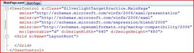
We're going to make a couple changes in the "UserControl" tag. Update the following properties:
d:DesignWidth="335"
d:DesignHeight="335"
Next, we'll replace the Grid with a set of nested StackPanels. The nested StackPanels will set up our 3 x 3 grid. As mentioned in the previous post, you can use a Grid here if you'd like, but I chose the StackPanels to keep the Button tags a little "cleaner". For the outer StackPanel, I set the Background to Black. Inside each of the nested StackPanels, I have placed 3 buttons. The buttons have fairly arbitrary names; this is just so we can tell them apart when we're doing the design work. The updated XAML looks like this:
(Click image to enlarge)
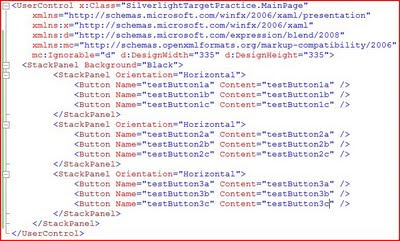
If you build and run the application at this point, you'll see this result. (Remember to run the Web application).
(Click image to enlarge)
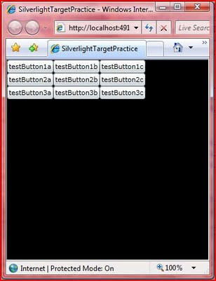
Step 2 - Templates
Now we're going to take advantage of the "lookless" controls in XAML and replace the default Button template. This will allow us full control over the way our buttons look and behave. This varies a little bit from the WPF sample: in the WPF sample, I used a combination of Templates and Styles; in this sample, we'll use only a Template.
We'll start our Template by adding a local resource to the file. Add a tag "UserControl.Resources" just above the outer StackPanel. As we've seen before, Visual Studio IntelliSense is very helpful when hand-editing XAML; so, let the code-completion do a lot of the work for you. You can also do this entire application in Expression Blend, but that's a lesson for another time. Inside the Resources section, we'll add a ControlTemplate for our buttons.
(Click image to enlarge)
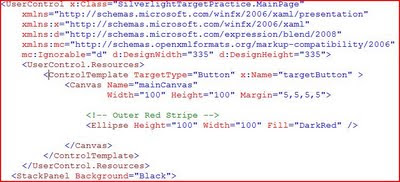
A few key things to point out. The TargetType is set to Button. This means that we can apply this template to Button controls (or their descendents) and only Button controls. Next is the x:Key. This gives a name to the Template that we can use to assign it elsewhere. Next we have a Canvas (our drawing surface with a Margin to space things out a little) and an Ellipse (which is just a DarkRed circle at this point). Note: the Ellipse is named "Outer Red Stripe" in the comments because we will be adding more to this template in just a bit.
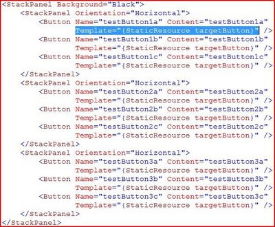
Now we'll need to apply our new Template to our Buttons. We do this by assigning the Template property of each button to the StaticResource that we just created. The highlighted code below is repeated for each button.
(Click image to enlarge)
Here's our result (ignore the jpeg artifacts in the picture; it actually looks much better in person):
(Click image to enlarge)
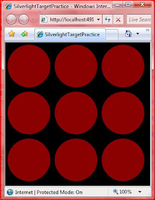
Something to note: the red circles are still buttons. They are clickable (although they don't visibly change when you click on them), and they have standard button events (such as Click). Notice that the Content does not appear in the buttons. This is because our Template does not have a ContentManager, nor do we need one for this application. Because we aren't displaying the Content, we can remove the Content properties from each of our buttons to clean up the code.
Now, let's spice up our visuals.
Step 3 - Eye Candy
Now we'll take the boring red circles and make them into glassy 3-D buttons. As I mentioned in the WPF XAML sample, the best way to learn how to do this is by looking at some Photoshop tutorials. The same techniques (gradient opacity ellipses) can be used in Expression Blend. I take no credit for the "glow" parts of the design template; I copied them from a demo by Walt Ritscher. He's also a good resource for WPF styles and templates.
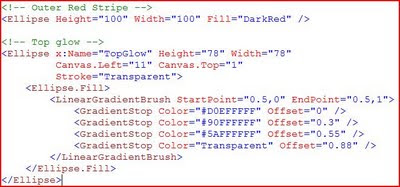
First, the top glow. This is simply added to our Control Template below the "Outer Red Stripe" code. It is just an ellipse with a radial gradient that moves from white to transparent.
(Click image to enlarge)
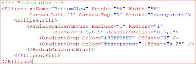
The bottom glow is much the same: just an ellipse with a radial gradient. We'll put this directly below the "Top Glow" code.
(Click image to enlarge)
If you build and run the application now, you'll see a distinct difference compared to what we had before:
(Click image to enlarge)
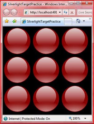
Cool, huh?
Step 4 - Completing the Targets
Next, we just need to complete the visual design of the Targets. This is just a set of ellipses, each smaller than the last, alternating between Red and White.
(Click image to enlarge)
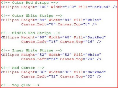
A few things to note here. First you'll see that we are moving the Canvas.Left and Canvas.Top properties because the Top Left corner is considered to be the starting point for drawing on a Canvas. We are moving down and a bit to the right to keep the smaller circle centered on the previous one.
Order is important here. The XAML parser processes items in the order that they appear in the file. This means that the "Outer Red Stripe" is drawn first, and then each smaller circle is drawn on top of it. The same is true of the "glows". We want these on top of the rest, so we specify them last in the file. The Canvas in Silverlight 3 does have a Z-Order property, so you can adjust this if you have a more complex drawing.
We're done with the visuals for our Targets. Now they look like this:
(Click image to enlarge)
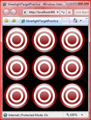
Step 5 - The Action
The last step is to add the behavior. This entire section is quite a bit different from the WPF sample, and all brand new to Silverlight 3.
As a reminder, when we click on any of the target buttons, we want it to animate by "falling over" and then reset after 3 seconds. The animation will work by using a Transform. The first step is to define an empty Transform to our Canvas. I have this inside the closing Canvas tag, but below all of the visuals we added above.
(Click image to enlarge)

This is where things really start to get interesting. For the Animation to be triggered by a Click, we need to add some References to our project: Microsoft.Expression.Interactions and System.Windows.Interactivity (noted below).
(Click image to enlarge)

Now we need to add a namespace reference to these assemblies. We add these at the top of the file with the other "xmlns" references. The good news is that you don't have to type all of this in (see the image below). Instead, IntelliSense will help you out. After you type the "=", you will get a pop-up of the assmeblies that are available from the project references. The completed namespace references should look like the image below:
(Click image to enlarge)

Next, we'll add an Interaction section to the Template that includes an EventTrigger. This needs to be placed before the closing Canvas tag. (I have it between the Transform and the end of the Canvas.) The EventTrigger specifies that it acts on the "MouseLeftButtonDown" event. And inside of that, we have an Animation Storyboard. Take a look at the EventTrigger and Animation specified below. Then we'll walk through it step by step.
(Click image to enlarge)
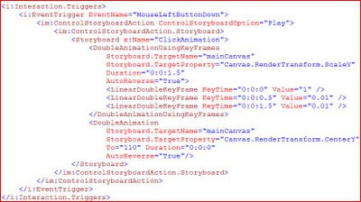
First, note the "i:Interaction.Triggers" tag. The "i:" is specifying that we are using an object in the System.Windows.Interactivity namespace that we referenced above. Next, we define our Event Trigger (also in the "i" namespace) and specify that it will act on the MouseLeftButtonDown event.
Now, we move on to the "im:ControlStoryboardAction" tag. The "im:" is referencing the Microsoft.Blend.Interactions namespace. This is denoting that we want to "Play" the Storyboard when the EventTrigger fires. Finally, we'll define the actual Storyboard in the "ControlStoryboardAction.Storyboard" section.
This contains a standard-looking Animation storyboard that we have named "ClickAnimaton". Let's look at each of the 2 animations in a little more detail.
The "DoubleAnimationUsingKeyFrames" says that we want to animate a double property (in this case the Y-Scale of the Canvas) and that we want to use KeyFrames to control the flow of the animation. The "Storyboard.Target" tells what object the storyboard is acting on (the Canvas in our Template), and the "Storyboard.TargetProperty" tells what property we are acting on. As noted before, we are operating on the Y-Scale of the Canvas by using the RenderTransform we defined earlier. Duration is 1.5 seconds and Auto-Reverse is true. This means that our total animation will be 3 seconds long.
Here's how we want our animation to work: first, we want it to "fall over" quickly (in 0.5 seconds), then stay "laying down" for a while, then pop back up quickly (also 0.5 seconds). They KeyFrames will let us do this. In the first "LinearKeyFrameAnimation", we are giving the starting position of 1, meaning set y-scaling to 100%. In the next, we want the y-scale to be set to 1% (almost invisible) at the half-second mark. The third shows that we want the y-scale to sill be at 1% at the 1.5 second mark. The auto-reverse runs the animation backwards (starting with the third KeyFrame and working up). This gives us a total animated time of 3 seconds.
The second animation is required because the origin of the Canvas is at the Top Left. This means that if we only had the first animation, the target would shrink up (toward the origin). The second animation says that we want to move the center point of the Canvas down so that it will shrink down and "fall over".
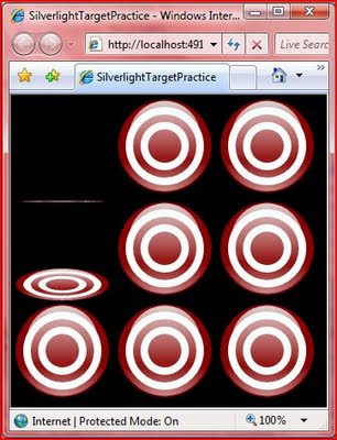
You'll have to run it yourself to see the final result. Here's a screen shot of things in action:
(Click image to enlarge)
Round Up
So, Silverlight 3 allows us to do much more in the XAML than Silverlight 2 allowed. We were able to reproduce the WPF XAML sample with a few changes. I expect that by the time .NET 4.0 and the next version of WPF rolls around, that WPF and Silverlight will look pretty much the same. But we'll still have to wait and see with that.
This is a good example of the power of declarative programming with XAML. The more I use it, the more I like it. When I think about trying to do an application like this in WinForms, I just shudder. It would be a mess of custom drawing code, timers, and crazy calculations. XAML gives me the freedom to easily take control over the layout and appearance of my application. And as we've seen here, it's not just limited to "look and feel", we can also program quite a bit of functionality with it.
You can add some code-behind and create a full fledged shooting gallery game that keeps track of scores and gives you a time limit. But I'll leave that as an exercise for the reader.
Happy coding!
The good new is that Silverlight 3 has additional support that allows us to replicate the XAML-only version of the application. It does vary a little bit from the WPF version, so even if you've looked through the previous post, you're likely to learn something new. I'll point out the differences as we come across them.
Scenario
We'll be creating a simple shooting gallery-type application. I call it "Target Practice" since it will require some more work to turn it into an actual game. In the final version, we will have a 3 x 3 grid of targets. Each of these is clickable adn will result in a "hit" animation. After 3 seconds, the target will reset to its previous state -- all inside the XAML. You can scroll down to the bottom to see the finished product.
Step 1 - Application Set-Up
We'll start by creating a new Silverlight 3 application. You'll need Visual Studio 2008, plus the Silverlight 3 bits (start here if you need them: http://silverlight.net/GetStarted/). Create a new project by selecting File -> New -> Project. From there, choose the "Silverlight" category under "Visual C#" and then select "Silverlight Application". I named my application "SilverlightTargetPractice".
You'll be asked if you want to create a web application to host the project. Go ahead and leave the defaults (create a new ASP.NET Web Site). This will give you 2 projects: "SilverlightTargetPractice" is your Silverlight application, and "SilverlightTargetPractice.Web" is the hosting web site. Whenever you run the project, you will want to run the web application.
In the Silverlight project, you will find the "MainPage.xaml" file. That's where we are going to start. Open up the xaml file, and you'll see the xaml editor. Note: There is no Silverlight 3 designer support in Visual Studio 2008; for that, you'll need Expression Blend 3. You can see my notes on this in a previous post. Here's the default page the project template creates:
(Click image to enlarge)

We're going to make a couple changes in the "UserControl" tag. Update the following properties:
d:DesignWidth="335"
d:DesignHeight="335"
Next, we'll replace the Grid with a set of nested StackPanels. The nested StackPanels will set up our 3 x 3 grid. As mentioned in the previous post, you can use a Grid here if you'd like, but I chose the StackPanels to keep the Button tags a little "cleaner". For the outer StackPanel, I set the Background to Black. Inside each of the nested StackPanels, I have placed 3 buttons. The buttons have fairly arbitrary names; this is just so we can tell them apart when we're doing the design work. The updated XAML looks like this:
(Click image to enlarge)

If you build and run the application at this point, you'll see this result. (Remember to run the Web application).
(Click image to enlarge)

Step 2 - Templates
Now we're going to take advantage of the "lookless" controls in XAML and replace the default Button template. This will allow us full control over the way our buttons look and behave. This varies a little bit from the WPF sample: in the WPF sample, I used a combination of Templates and Styles; in this sample, we'll use only a Template.
We'll start our Template by adding a local resource to the file. Add a tag "UserControl.Resources" just above the outer StackPanel. As we've seen before, Visual Studio IntelliSense is very helpful when hand-editing XAML; so, let the code-completion do a lot of the work for you. You can also do this entire application in Expression Blend, but that's a lesson for another time. Inside the Resources section, we'll add a ControlTemplate for our buttons.
(Click image to enlarge)

A few key things to point out. The TargetType is set to Button. This means that we can apply this template to Button controls (or their descendents) and only Button controls. Next is the x:Key. This gives a name to the Template that we can use to assign it elsewhere. Next we have a Canvas (our drawing surface with a Margin to space things out a little) and an Ellipse (which is just a DarkRed circle at this point). Note: the Ellipse is named "Outer Red Stripe" in the comments because we will be adding more to this template in just a bit.
Now we'll need to apply our new Template to our Buttons. We do this by assigning the Template property of each button to the StaticResource that we just created. The highlighted code below is repeated for each button.
(Click image to enlarge)

Here's our result (ignore the jpeg artifacts in the picture; it actually looks much better in person):
(Click image to enlarge)

Something to note: the red circles are still buttons. They are clickable (although they don't visibly change when you click on them), and they have standard button events (such as Click). Notice that the Content does not appear in the buttons. This is because our Template does not have a ContentManager, nor do we need one for this application. Because we aren't displaying the Content, we can remove the Content properties from each of our buttons to clean up the code.
Now, let's spice up our visuals.
Step 3 - Eye Candy
Now we'll take the boring red circles and make them into glassy 3-D buttons. As I mentioned in the WPF XAML sample, the best way to learn how to do this is by looking at some Photoshop tutorials. The same techniques (gradient opacity ellipses) can be used in Expression Blend. I take no credit for the "glow" parts of the design template; I copied them from a demo by Walt Ritscher. He's also a good resource for WPF styles and templates.
First, the top glow. This is simply added to our Control Template below the "Outer Red Stripe" code. It is just an ellipse with a radial gradient that moves from white to transparent.
(Click image to enlarge)

The bottom glow is much the same: just an ellipse with a radial gradient. We'll put this directly below the "Top Glow" code.
(Click image to enlarge)

If you build and run the application now, you'll see a distinct difference compared to what we had before:
(Click image to enlarge)

Cool, huh?
Step 4 - Completing the Targets
Next, we just need to complete the visual design of the Targets. This is just a set of ellipses, each smaller than the last, alternating between Red and White.
(Click image to enlarge)

A few things to note here. First you'll see that we are moving the Canvas.Left and Canvas.Top properties because the Top Left corner is considered to be the starting point for drawing on a Canvas. We are moving down and a bit to the right to keep the smaller circle centered on the previous one.
Order is important here. The XAML parser processes items in the order that they appear in the file. This means that the "Outer Red Stripe" is drawn first, and then each smaller circle is drawn on top of it. The same is true of the "glows". We want these on top of the rest, so we specify them last in the file. The Canvas in Silverlight 3 does have a Z-Order property, so you can adjust this if you have a more complex drawing.
We're done with the visuals for our Targets. Now they look like this:
(Click image to enlarge)

Step 5 - The Action
The last step is to add the behavior. This entire section is quite a bit different from the WPF sample, and all brand new to Silverlight 3.
As a reminder, when we click on any of the target buttons, we want it to animate by "falling over" and then reset after 3 seconds. The animation will work by using a Transform. The first step is to define an empty Transform to our Canvas. I have this inside the closing Canvas tag, but below all of the visuals we added above.
(Click image to enlarge)

This is where things really start to get interesting. For the Animation to be triggered by a Click, we need to add some References to our project: Microsoft.Expression.Interactions and System.Windows.Interactivity (noted below).
(Click image to enlarge)

Now we need to add a namespace reference to these assemblies. We add these at the top of the file with the other "xmlns" references. The good news is that you don't have to type all of this in (see the image below). Instead, IntelliSense will help you out. After you type the "=", you will get a pop-up of the assmeblies that are available from the project references. The completed namespace references should look like the image below:
(Click image to enlarge)

Next, we'll add an Interaction section to the Template that includes an EventTrigger. This needs to be placed before the closing Canvas tag. (I have it between the Transform and the end of the Canvas.) The EventTrigger specifies that it acts on the "MouseLeftButtonDown" event. And inside of that, we have an Animation Storyboard. Take a look at the EventTrigger and Animation specified below. Then we'll walk through it step by step.
(Click image to enlarge)

First, note the "i:Interaction.Triggers" tag. The "i:" is specifying that we are using an object in the System.Windows.Interactivity namespace that we referenced above. Next, we define our Event Trigger (also in the "i" namespace) and specify that it will act on the MouseLeftButtonDown event.
Now, we move on to the "im:ControlStoryboardAction" tag. The "im:" is referencing the Microsoft.Blend.Interactions namespace. This is denoting that we want to "Play" the Storyboard when the EventTrigger fires. Finally, we'll define the actual Storyboard in the "ControlStoryboardAction.Storyboard" section.
This contains a standard-looking Animation storyboard that we have named "ClickAnimaton". Let's look at each of the 2 animations in a little more detail.
The "DoubleAnimationUsingKeyFrames" says that we want to animate a double property (in this case the Y-Scale of the Canvas) and that we want to use KeyFrames to control the flow of the animation. The "Storyboard.Target" tells what object the storyboard is acting on (the Canvas in our Template), and the "Storyboard.TargetProperty" tells what property we are acting on. As noted before, we are operating on the Y-Scale of the Canvas by using the RenderTransform we defined earlier. Duration is 1.5 seconds and Auto-Reverse is true. This means that our total animation will be 3 seconds long.
Here's how we want our animation to work: first, we want it to "fall over" quickly (in 0.5 seconds), then stay "laying down" for a while, then pop back up quickly (also 0.5 seconds). They KeyFrames will let us do this. In the first "LinearKeyFrameAnimation", we are giving the starting position of 1, meaning set y-scaling to 100%. In the next, we want the y-scale to be set to 1% (almost invisible) at the half-second mark. The third shows that we want the y-scale to sill be at 1% at the 1.5 second mark. The auto-reverse runs the animation backwards (starting with the third KeyFrame and working up). This gives us a total animated time of 3 seconds.
The second animation is required because the origin of the Canvas is at the Top Left. This means that if we only had the first animation, the target would shrink up (toward the origin). The second animation says that we want to move the center point of the Canvas down so that it will shrink down and "fall over".
You'll have to run it yourself to see the final result. Here's a screen shot of things in action:
(Click image to enlarge)

Round Up
So, Silverlight 3 allows us to do much more in the XAML than Silverlight 2 allowed. We were able to reproduce the WPF XAML sample with a few changes. I expect that by the time .NET 4.0 and the next version of WPF rolls around, that WPF and Silverlight will look pretty much the same. But we'll still have to wait and see with that.
This is a good example of the power of declarative programming with XAML. The more I use it, the more I like it. When I think about trying to do an application like this in WinForms, I just shudder. It would be a mess of custom drawing code, timers, and crazy calculations. XAML gives me the freedom to easily take control over the layout and appearance of my application. And as we've seen here, it's not just limited to "look and feel", we can also program quite a bit of functionality with it.
You can add some code-behind and create a full fledged shooting gallery game that keeps track of scores and gives you a time limit. But I'll leave that as an exercise for the reader.
Happy coding!
Subscribe to:
Posts (Atom)