Back in December, I mentioned that there were updates coming for application guidance on WPF/Silverlight (Prism) and for Windows Store Apps (Kona). Well, here's a few more interesting things to look at.
Kona: Guidance for Building Windows Store LOB Apps
The biggest news is that the Kona guidance for building Windows Store Apps is moving forward. Brian Noyes was on .NET Rocks last week (http://www.dotnetrocks.com/default.aspx?showNum=847) talking about the work that Microsoft Patterns & Practices is putting into their latest guidance package. If you're interested in carrying over a Prism-like development style to Windows Store Apps, then this episode is definitely worth the listen.
Kona isn't released quite yet; it's still in beta. But Brian mentioned that they are doing (near) weekly drops on the Codeplex pages; check out the latest here: http://konaguidance.codeplex.com/. At the time of this writing, the latest version is from February 22, 2013. It looks like the release will happen sometime in March, but keep your eyes on the site.
Why Not Prism for Windows Store Apps?
One question that came up during the .NET Rocks episode is why Kona is a separate guidance package rather than an extension of the current Prism framework. There are a couple of primary reasons.
First, Windows Store Apps are different enough from WPF and Silverlight apps that the approaches to development may not translate well. So, rather than trying to fit a square peg into a round hole, the team decided to start from scratch. The approach was to first build a Line of Business application (the type that a corporate developer might build) and then work backwards to see what common items can be made easier by extracting them into the Kona framework.
Next, there are certain things in Prism that just don't make sense in the Windows Store App world. For example, Prism includes extensive support for Regions -- a way to put different views into different parts of the shell. In the full-screen world of Windows Store Apps (it's killing me not to just say "Metro" here...), the idea of regions just doesn't fit.
Additionally, Prism has good support for dynamically loading modules. This gives you the ability to drop assemblies into a folder that can then get loaded into the application at runtime. In the Windows Store App world, all of the assemblies need to be included in the package that is submitted to the store. So, there's no way to just "drop in a new assembly". All of the functionality needs to be included up front.
So, it makes sense that the Kona guidance is separate from Prism. I haven't taken a close look at Kona yet (I still haven't jumped into the Windows Store App world), so I don't have any opinions at this point. But, if I do need to build line of business applications for Windows Store Apps, I'll definitely start here.
Prism 4.5
One other interesting thing that Brian mentioned is that Prism is basically "done". That doesn't mean that it has hit end-of-life or anything like that (so don't panic). It just means that the framework has gone as far as it needs to, so we shouldn't expect new features at this point.
Prism has been compiled to work against the .NET 4.5 framework (you can get the latest from Codeplex: http://compositewpf.codeplex.com/releases/view/95815). But the features and functionality are the same as Prism 4.1. Brian did mention that we can expect an updated version when Patterns & Practices releases the next version of Unity, but there won't be any new functionality.
Wrap Up
I'm not necessarily an advocate of using either Prism or Kona. As with any framework, you need to take a close look at the problems that the framework addresses. If you don't have those problems, then it's probably not the right framework for you.
As mentioned previously (Five Months In: Working with Prism and WPF), Prism worked very well on the last major project I was involved with. But we also had many of the concerns that the framework set out to solve (such as Regions, Navigation, Modularity, and MVVM helpers). Your mileage may vary.
It's always good to know what's available. Then we are more likely to pick the right tool for the job when it's time to build a particular type of application. Keep expanding the toolbox.
Happy Coding!
Showing posts with label Silverlight. Show all posts
Showing posts with label Silverlight. Show all posts
Sunday, March 3, 2013


Tuesday, March 13, 2012
XAML Tip: Gradients
XAML makes a lot of things easier. Technically, everything you can do in XAML can also be done in other UI platforms, but XAML just makes it so simple that you're more likely to do them. What this also means is that we need to think a bit differently when it comes to designing our UIs.
Gradients in the Real World
First, I'll start by saying that I am not a designer; most of these tips have come people way smarter than I am. Personally, I like gradients -- probably a little bit too much. They have the ability to make some things look more natural.
There are no solid colors in the real world. Think about this for a moment. There are a lot of colors that we perceive as being solid, but when we really look at them, there is some sort of variation (from top to bottom, from side to side, or from some arbitrary angle) based on how the light hits the object. Because of this, we can add gradients to our applications to make them look more natural; they can also add a bit of visual interest as well.
Gradients in XAML
XAML makes it very easy to add a gradient. All we need to do is create a gradient brush, and we have a couple of options for that: LinearGradientBrush and RadialGradientBrush. The LinearGradientBrush lets us create gradients that move evenly from top to bottom, from left ot right, or from one side to another at whatever angle we choose. The RadialGradientBrush starts at a point and radiates outward (you can think about this as the highlight that you see on the surface of a sphere).
When you create the gradient brush, you specify the gradient stops. This is how you let XAML know where each color should be along the continuum. If you've taken a look at my samples, you know that I have a particular gradient background that I always use. (I'm not recommending this. It's something that I'm used to that doesn't look too bad.)
Here's the gradient definition:

And what it looks like:

What this means: the start point is the starting point for our gradient. In this case, we are using point "0,0" which is at the top-right of the control. The end point "1,1" specifies the bottom-left corner. So, we will end up with a diagonal gradient. Next we have 2 or more gradient stops. The offset value is a value between 0 and 1 to specify where the color should be. In this case, the first gradient stop is at "0", meaning put Alice Blue at the beginning of the gradient (in this case, the top-right corner). The second gradient stop is at "0.7" which you can translate as 70% across the gradient. This point should be Steel Blue. Since we do not have any additional gradient stops, this color will be "solid" through the end of the gradient.
The great thing about specifying gradients in XAML is that we just specify the gradient stops (where we want our "solid" colors to be). The XAML renderer figures out how to make the smooth transition from one color to the next.
Gradients in the UI
Here's another example of an application that uses gradients as control backgrounds. Note: this is an actual application that I wrote and deployed (but the names have been changed to protect the innocent).

Here you can see gradients in the header, the client area, and the login box. One thing to note about these gradients is that they move from one color to a similar color. In the case of the client area, it moves from "Ivory" to "Moccasin" and back to "Ivory". The login box moves from "Steel Blue" to "Dark Blue" and back to "Steel Blue".
Here is the gradient that's used for the header and login box:

This is a little different from our previous gradient. First, the start point and end point specify that this will be a gradient that goes from top to bottom. This time we have 3 gradient stops. The first one specifies Steel Blue at the start point. The second specifies Dark Blue at the 90% mark. The third goes back to Steel Blue at the 100% mark. We can see this as the color moves gradually from Steel Blue (the lighter blue) to Dark Blue, and then quickly back to Steel Blue.
If we were to move from "Steel Blue" to "Orange", things would look a little strange. Think about the gradients that we see in nature. We see subtle differences in colors -- moving from white to gray, or from lemon yellow to a darker yellow. If we create a jarring gradient, then it has the same effect as a rainbow wig -- attention getting, jarring, and unnatural.
Subtler Gradients
In addition to using gradients for control backgrounds, we can also use them more subtly. Take a look at the following screenshot:

Can you tell how this differs from the screenshot above? If you're anything like me, you can see a difference and maybe have a preference, but you have difficulty pointing out what the difference is. Here's are side-by-side comparisons of the affected area:


The difference is that we applied a gradient to the text of the application name. The great thing about XAML is that it makes this incredibly easy. In fact, for this sample, we're using the same gradient for the header, the login box, and the application name. This gradient is stored as an application resource in the App.xaml file. This makes it easy to share across our screens (and also very easy to update if we change our design).
We'll be looking at this application in a little more detail in future posts. At that point, we'll see a few more cool XAML features and how it can add value to our UI.
Happy Coding!
Gradients in the Real World
First, I'll start by saying that I am not a designer; most of these tips have come people way smarter than I am. Personally, I like gradients -- probably a little bit too much. They have the ability to make some things look more natural.
There are no solid colors in the real world. Think about this for a moment. There are a lot of colors that we perceive as being solid, but when we really look at them, there is some sort of variation (from top to bottom, from side to side, or from some arbitrary angle) based on how the light hits the object. Because of this, we can add gradients to our applications to make them look more natural; they can also add a bit of visual interest as well.
Gradients in XAML
XAML makes it very easy to add a gradient. All we need to do is create a gradient brush, and we have a couple of options for that: LinearGradientBrush and RadialGradientBrush. The LinearGradientBrush lets us create gradients that move evenly from top to bottom, from left ot right, or from one side to another at whatever angle we choose. The RadialGradientBrush starts at a point and radiates outward (you can think about this as the highlight that you see on the surface of a sphere).
When you create the gradient brush, you specify the gradient stops. This is how you let XAML know where each color should be along the continuum. If you've taken a look at my samples, you know that I have a particular gradient background that I always use. (I'm not recommending this. It's something that I'm used to that doesn't look too bad.)
Here's the gradient definition:

And what it looks like:
What this means: the start point is the starting point for our gradient. In this case, we are using point "0,0" which is at the top-right of the control. The end point "1,1" specifies the bottom-left corner. So, we will end up with a diagonal gradient. Next we have 2 or more gradient stops. The offset value is a value between 0 and 1 to specify where the color should be. In this case, the first gradient stop is at "0", meaning put Alice Blue at the beginning of the gradient (in this case, the top-right corner). The second gradient stop is at "0.7" which you can translate as 70% across the gradient. This point should be Steel Blue. Since we do not have any additional gradient stops, this color will be "solid" through the end of the gradient.
The great thing about specifying gradients in XAML is that we just specify the gradient stops (where we want our "solid" colors to be). The XAML renderer figures out how to make the smooth transition from one color to the next.
Gradients in the UI
Here's another example of an application that uses gradients as control backgrounds. Note: this is an actual application that I wrote and deployed (but the names have been changed to protect the innocent).

Here you can see gradients in the header, the client area, and the login box. One thing to note about these gradients is that they move from one color to a similar color. In the case of the client area, it moves from "Ivory" to "Moccasin" and back to "Ivory". The login box moves from "Steel Blue" to "Dark Blue" and back to "Steel Blue".
Here is the gradient that's used for the header and login box:

This is a little different from our previous gradient. First, the start point and end point specify that this will be a gradient that goes from top to bottom. This time we have 3 gradient stops. The first one specifies Steel Blue at the start point. The second specifies Dark Blue at the 90% mark. The third goes back to Steel Blue at the 100% mark. We can see this as the color moves gradually from Steel Blue (the lighter blue) to Dark Blue, and then quickly back to Steel Blue.
If we were to move from "Steel Blue" to "Orange", things would look a little strange. Think about the gradients that we see in nature. We see subtle differences in colors -- moving from white to gray, or from lemon yellow to a darker yellow. If we create a jarring gradient, then it has the same effect as a rainbow wig -- attention getting, jarring, and unnatural.
Subtler Gradients
In addition to using gradients for control backgrounds, we can also use them more subtly. Take a look at the following screenshot:

Can you tell how this differs from the screenshot above? If you're anything like me, you can see a difference and maybe have a preference, but you have difficulty pointing out what the difference is. Here's are side-by-side comparisons of the affected area:


The difference is that we applied a gradient to the text of the application name. The great thing about XAML is that it makes this incredibly easy. In fact, for this sample, we're using the same gradient for the header, the login box, and the application name. This gradient is stored as an application resource in the App.xaml file. This makes it easy to share across our screens (and also very easy to update if we change our design).
We'll be looking at this application in a little more detail in future posts. At that point, we'll see a few more cool XAML features and how it can add value to our UI.
Happy Coding!
Saturday, February 25, 2012
XAML Namespaces and Default Properties
Here are a few questions that have come up during some recent "XAML: Don't Fear the Markup" presentations.
Question: How can you tell what is in the namespaces that are included by default in the XAML markup?
MSDN and the Visual Studio Help contain listings of the elements that are in the namespaces. For example, the "x:" namespace (xmlns:x="http://schemas.microsoft.com/winfx/2006/xaml") is available in this article: XAML Namespace (x:) Language Features. It's interesting to take a quick tour through this list. It shows the "x:Class", "x:Name", and "x:Key" that were mentioned in the presentation; but it also shows things like "x:Null" which are useful for resetting a property that would normally be inherited. For example, if you have a custom Style, you can choose to have that style automatically applied to all of the applicable controls in the XAML document. If a control needs to use the default style rather than the custom style, you can set that control's style to "{x:Null}" to reset the value.
The other namespace that we looked at a little was the "d:" namespace (xmlns:d="http://schemas.microsoft.com/expression/blend/2008"). This also has an article describing the members: Design-Time Attributes in the Silverlight Designer. This shows the "d:DesignHeight" and "d:DesignWidth" that we saw in the sample. It also has some interesting things to look into further such as "d:DataContext" which lets you set up a design-time data context for data binding. In our sample, the databinding was hooked up to a local object, so the design-time view worked without doing anything special. But if you had remote data (for example, customer data coming from a SQL database), then you wouldn't have that data available at design time. In that case, you could use the "d:DataContext" to hook up to a local object that had some sample hard-coded data. These are all design-time functions. They are there to help you with your XAML page/window/user control creation. At run time, your actual data context would be used.
Question: The XAML namespaces use the URI format ("http://..."). How should you name your own namespaces?
When creating your own namespaces, you should follow whatever namespace naming convention that you have in place. There is no need to use the URI format; instead, simply use the standard .NET namespace naming -- usually something like "CompanyName.Product.Module". In the sample, we saw how to bring in a namespace that is local to our project, which ended up looking like this: xmlns:local="clr-namespace:JeremyBytes.StopWatch". But it is fairly simple to bring in namespaces from other assemblies that are referenced in the current project. You can get more information here: XAML Namespaces and Namespace Mapping for WPF XAML.
Question: How can you identify the default property of a XAML element?
The default property of a XAML element is the property that we can simply put "between the tags" without any specific references. In our sample, we saw that we could specify the content property for a button by simply putting the content between the opening and closing tags: "<Button...>Start</Button>". The question is how do we know which property is the default property?
The default properties are specified in the help file. So, all we need to do is press "F1" on any of our controls to see what the value is. Here are a few samples:


 Here, we can see what the default properties are for each of these elements. As we saw in the sample, we are always free to explicitly specify the property, but using the default property syntax can help keep our markup more readable.
If you have any questions about the XAML presentation or walkthrough, feel free to send them along to me.
Happy Coding!
MSDN and the Visual Studio Help contain listings of the elements that are in the namespaces. For example, the "x:" namespace (xmlns:x="http://schemas.microsoft.com/winfx/2006/xaml") is available in this article: XAML Namespace (x:) Language Features. It's interesting to take a quick tour through this list. It shows the "x:Class", "x:Name", and "x:Key" that were mentioned in the presentation; but it also shows things like "x:Null" which are useful for resetting a property that would normally be inherited. For example, if you have a custom Style, you can choose to have that style automatically applied to all of the applicable controls in the XAML document. If a control needs to use the default style rather than the custom style, you can set that control's style to "{x:Null}" to reset the value.
The other namespace that we looked at a little was the "d:" namespace (xmlns:d="http://schemas.microsoft.com/expression/blend/2008"). This also has an article describing the members: Design-Time Attributes in the Silverlight Designer. This shows the "d:DesignHeight" and "d:DesignWidth" that we saw in the sample. It also has some interesting things to look into further such as "d:DataContext" which lets you set up a design-time data context for data binding. In our sample, the databinding was hooked up to a local object, so the design-time view worked without doing anything special. But if you had remote data (for example, customer data coming from a SQL database), then you wouldn't have that data available at design time. In that case, you could use the "d:DataContext" to hook up to a local object that had some sample hard-coded data. These are all design-time functions. They are there to help you with your XAML page/window/user control creation. At run time, your actual data context would be used.
Question: The XAML namespaces use the URI format ("http://..."). How should you name your own namespaces?
When creating your own namespaces, you should follow whatever namespace naming convention that you have in place. There is no need to use the URI format; instead, simply use the standard .NET namespace naming -- usually something like "CompanyName.Product.Module". In the sample, we saw how to bring in a namespace that is local to our project, which ended up looking like this: xmlns:local="clr-namespace:JeremyBytes.StopWatch". But it is fairly simple to bring in namespaces from other assemblies that are referenced in the current project. You can get more information here: XAML Namespaces and Namespace Mapping for WPF XAML.
Question: How can you identify the default property of a XAML element?
The default property of a XAML element is the property that we can simply put "between the tags" without any specific references. In our sample, we saw that we could specify the content property for a button by simply putting the content between the opening and closing tags: "<Button...>Start</Button>". The question is how do we know which property is the default property?
The default properties are specified in the help file. So, all we need to do is press "F1" on any of our controls to see what the value is. Here are a few samples:
If you have any questions about the XAML presentation or walkthrough, feel free to send them along to me.
Happy Coding!
Monday, February 20, 2012
San Diego .NET UI Developers SIG
For those of you in the San Diego area, I'll be speaking at the San Diego .NET UI Developers SIG tomorrow night (February 21, 2012). Details are available here: San Diego .NET User Group.
The topic is XAML: Don't Fear the Markup. We'll be getting comfortable with the XAML markup and see how we can tweak it to meet our UI needs. In addition, we'll take a look at a few cool design tricks that we can use to add a little "glow" to our UI. Hope to see you there.
Happy Coding!
The topic is XAML: Don't Fear the Markup. We'll be getting comfortable with the XAML markup and see how we can tweak it to meet our UI needs. In addition, we'll take a look at a few cool design tricks that we can use to add a little "glow" to our UI. Hope to see you there.
Happy Coding!
Monday, May 31, 2010
Updated Sessions
I have updated a number of my sessions for Visual Studio 2010 and/or Silverlight 4. I will be presenting three of these sessions at the So Cal Code Camp coming up on June 26 & 27, 2010. These are all available for download here: http://www.jeremybytes.com/demos.aspx.
Introduction to the BackgroundWorker Component with WPF
Long running processes are a user experience killer. How many times have you had an application "lock up" while trying to do some function? The BackgroundWorker component in .NET allows you to spawn those long running processes in the background and keep your WPF, Silverlight, or WinForms user interface responsive. We'll take a look at the features of the BackgroundWorker in a WPF application including running a background process, updating the progress in the UI, and cancelling the process before it has completed.
This session has been expanded to include Exception Handling and additional error checking.
Walkthrough: BackgroundWorker-WPF2010.pdf
Sample Code: BackgroundWorker-WPF2010.zip
Introduction to Data Templates and Value Converters in Silverlight
Business applications are all about data, and laying out that data is critical to creating a good user experience. Silverlight has several tools, including Data Templates and Value Converters, that make this easier for the business developer to manage. By the time we're done, you will have a good understanding of the basics of both of these valuable tools.
This session has been updated for Silverlight 4.
Walkthrough: DataTemplatesAndConverters2010.pdf
Sample Code: DataTemplatesAndConverters2010.zip
Introduction to XAML - WPF 2010 / Silverlight 4
Understanding XAML (eXtensible Application Markup Language) is a key to creating the latest .NET user experiences in WPF and Silverlight. We will introduce the basic concepts around XAML and take a look at various features such as namespaces, elements, properties, events, attached properties and some basic layout. We’ll create a simple WPF or Silverlight application that covers these fundamentals. Although you will probably end up doing most of your UI design with a drag-and-drop tool such as Expression Blend, knowing the internals gives you a leg up in making the final tweaks to ensure an excellent user experience.
This session has been updated to include both WPF and Silverlight versions. The same core XAML features are covered in each environment.
Walkthrough (WPF): IntroToXAML-WPF2010.pdf
Sample Code (WPF): IntroToXAML-WPF2010.zip
Walkthrough (Silverlight): IntroToXAML-Silverlight4.pdf
Sample Code (Silverlight): IntroToXAML-Silverlight4.zip
As always, your feedback/questions on any of these sessions is appreciated: feedback@jeremybytes.com.
Happy Coding!
Introduction to the BackgroundWorker Component with WPF
Long running processes are a user experience killer. How many times have you had an application "lock up" while trying to do some function? The BackgroundWorker component in .NET allows you to spawn those long running processes in the background and keep your WPF, Silverlight, or WinForms user interface responsive. We'll take a look at the features of the BackgroundWorker in a WPF application including running a background process, updating the progress in the UI, and cancelling the process before it has completed.
This session has been expanded to include Exception Handling and additional error checking.
Walkthrough: BackgroundWorker-WPF2010.pdf
Sample Code: BackgroundWorker-WPF2010.zip
Introduction to Data Templates and Value Converters in Silverlight
Business applications are all about data, and laying out that data is critical to creating a good user experience. Silverlight has several tools, including Data Templates and Value Converters, that make this easier for the business developer to manage. By the time we're done, you will have a good understanding of the basics of both of these valuable tools.
This session has been updated for Silverlight 4.
Walkthrough: DataTemplatesAndConverters2010.pdf
Sample Code: DataTemplatesAndConverters2010.zip
Introduction to XAML - WPF 2010 / Silverlight 4
Understanding XAML (eXtensible Application Markup Language) is a key to creating the latest .NET user experiences in WPF and Silverlight. We will introduce the basic concepts around XAML and take a look at various features such as namespaces, elements, properties, events, attached properties and some basic layout. We’ll create a simple WPF or Silverlight application that covers these fundamentals. Although you will probably end up doing most of your UI design with a drag-and-drop tool such as Expression Blend, knowing the internals gives you a leg up in making the final tweaks to ensure an excellent user experience.
This session has been updated to include both WPF and Silverlight versions. The same core XAML features are covered in each environment.
Walkthrough (WPF): IntroToXAML-WPF2010.pdf
Sample Code (WPF): IntroToXAML-WPF2010.zip
Walkthrough (Silverlight): IntroToXAML-Silverlight4.pdf
Sample Code (Silverlight): IntroToXAML-Silverlight4.zip
As always, your feedback/questions on any of these sessions is appreciated: feedback@jeremybytes.com.
Happy Coding!
Friday, September 4, 2009
Target Practice - Silverlight 3 / XAML Sample
XAML has intrigued me ever since I took a close look at it. In a previous post, I created an entire WPF application using only XAML (it's trivial, yet functional). When I got started with Silverlight 2, I wanted to replicate that application. Unfortunately, there were limitations to Silverlight 2 (such as a lack of triggers) that kept me from implementing it. I could have built the same application, but it would have required some code-behind to handle the animation.
The good new is that Silverlight 3 has additional support that allows us to replicate the XAML-only version of the application. It does vary a little bit from the WPF version, so even if you've looked through the previous post, you're likely to learn something new. I'll point out the differences as we come across them.
Scenario
We'll be creating a simple shooting gallery-type application. I call it "Target Practice" since it will require some more work to turn it into an actual game. In the final version, we will have a 3 x 3 grid of targets. Each of these is clickable adn will result in a "hit" animation. After 3 seconds, the target will reset to its previous state -- all inside the XAML. You can scroll down to the bottom to see the finished product.
Step 1 - Application Set-Up
We'll start by creating a new Silverlight 3 application. You'll need Visual Studio 2008, plus the Silverlight 3 bits (start here if you need them: http://silverlight.net/GetStarted/). Create a new project by selecting File -> New -> Project. From there, choose the "Silverlight" category under "Visual C#" and then select "Silverlight Application". I named my application "SilverlightTargetPractice".
You'll be asked if you want to create a web application to host the project. Go ahead and leave the defaults (create a new ASP.NET Web Site). This will give you 2 projects: "SilverlightTargetPractice" is your Silverlight application, and "SilverlightTargetPractice.Web" is the hosting web site. Whenever you run the project, you will want to run the web application.
In the Silverlight project, you will find the "MainPage.xaml" file. That's where we are going to start. Open up the xaml file, and you'll see the xaml editor. Note: There is no Silverlight 3 designer support in Visual Studio 2008; for that, you'll need Expression Blend 3. You can see my notes on this in a previous post. Here's the default page the project template creates:
(Click image to enlarge)
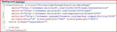
We're going to make a couple changes in the "UserControl" tag. Update the following properties:
d:DesignWidth="335"
d:DesignHeight="335"
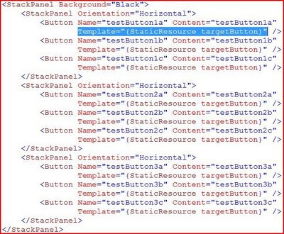
Next, we'll replace the Grid with a set of nested StackPanels. The nested StackPanels will set up our 3 x 3 grid. As mentioned in the previous post, you can use a Grid here if you'd like, but I chose the StackPanels to keep the Button tags a little "cleaner". For the outer StackPanel, I set the Background to Black. Inside each of the nested StackPanels, I have placed 3 buttons. The buttons have fairly arbitrary names; this is just so we can tell them apart when we're doing the design work. The updated XAML looks like this:
(Click image to enlarge)
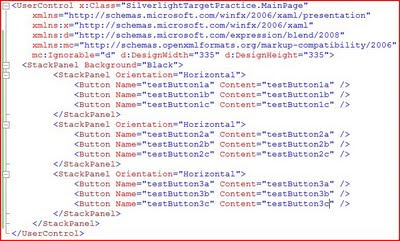
If you build and run the application at this point, you'll see this result. (Remember to run the Web application).
(Click image to enlarge)
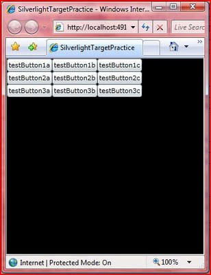
Step 2 - Templates
Now we're going to take advantage of the "lookless" controls in XAML and replace the default Button template. This will allow us full control over the way our buttons look and behave. This varies a little bit from the WPF sample: in the WPF sample, I used a combination of Templates and Styles; in this sample, we'll use only a Template.
We'll start our Template by adding a local resource to the file. Add a tag "UserControl.Resources" just above the outer StackPanel. As we've seen before, Visual Studio IntelliSense is very helpful when hand-editing XAML; so, let the code-completion do a lot of the work for you. You can also do this entire application in Expression Blend, but that's a lesson for another time. Inside the Resources section, we'll add a ControlTemplate for our buttons.
(Click image to enlarge)
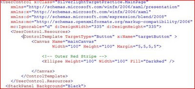
A few key things to point out. The TargetType is set to Button. This means that we can apply this template to Button controls (or their descendents) and only Button controls. Next is the x:Key. This gives a name to the Template that we can use to assign it elsewhere. Next we have a Canvas (our drawing surface with a Margin to space things out a little) and an Ellipse (which is just a DarkRed circle at this point). Note: the Ellipse is named "Outer Red Stripe" in the comments because we will be adding more to this template in just a bit.
Now we'll need to apply our new Template to our Buttons. We do this by assigning the Template property of each button to the StaticResource that we just created. The highlighted code below is repeated for each button.
(Click image to enlarge)
Here's our result (ignore the jpeg artifacts in the picture; it actually looks much better in person):
(Click image to enlarge)
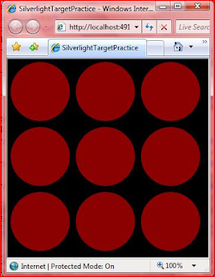
Something to note: the red circles are still buttons. They are clickable (although they don't visibly change when you click on them), and they have standard button events (such as Click). Notice that the Content does not appear in the buttons. This is because our Template does not have a ContentManager, nor do we need one for this application. Because we aren't displaying the Content, we can remove the Content properties from each of our buttons to clean up the code.
Now, let's spice up our visuals.
Step 3 - Eye Candy
Now we'll take the boring red circles and make them into glassy 3-D buttons. As I mentioned in the WPF XAML sample, the best way to learn how to do this is by looking at some Photoshop tutorials. The same techniques (gradient opacity ellipses) can be used in Expression Blend. I take no credit for the "glow" parts of the design template; I copied them from a demo by Walt Ritscher. He's also a good resource for WPF styles and templates.
First, the top glow. This is simply added to our Control Template below the "Outer Red Stripe" code. It is just an ellipse with a radial gradient that moves from white to transparent.
(Click image to enlarge)
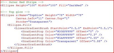
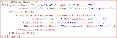
The bottom glow is much the same: just an ellipse with a radial gradient. We'll put this directly below the "Top Glow" code.
(Click image to enlarge)
If you build and run the application now, you'll see a distinct difference compared to what we had before:
(Click image to enlarge)
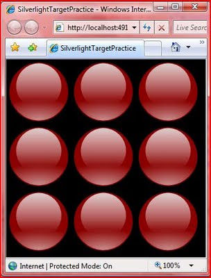
Cool, huh?
Step 4 - Completing the Targets
Next, we just need to complete the visual design of the Targets. This is just a set of ellipses, each smaller than the last, alternating between Red and White.
(Click image to enlarge)
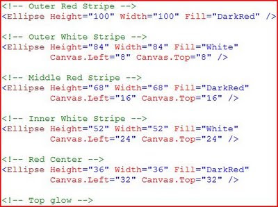
A few things to note here. First you'll see that we are moving the Canvas.Left and Canvas.Top properties because the Top Left corner is considered to be the starting point for drawing on a Canvas. We are moving down and a bit to the right to keep the smaller circle centered on the previous one.
Order is important here. The XAML parser processes items in the order that they appear in the file. This means that the "Outer Red Stripe" is drawn first, and then each smaller circle is drawn on top of it. The same is true of the "glows". We want these on top of the rest, so we specify them last in the file. The Canvas in Silverlight 3 does have a Z-Order property, so you can adjust this if you have a more complex drawing.
We're done with the visuals for our Targets. Now they look like this:
(Click image to enlarge)
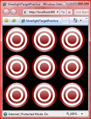
Step 5 - The Action
The last step is to add the behavior. This entire section is quite a bit different from the WPF sample, and all brand new to Silverlight 3.
As a reminder, when we click on any of the target buttons, we want it to animate by "falling over" and then reset after 3 seconds. The animation will work by using a Transform. The first step is to define an empty Transform to our Canvas. I have this inside the closing Canvas tag, but below all of the visuals we added above.
(Click image to enlarge)

This is where things really start to get interesting. For the Animation to be triggered by a Click, we need to add some References to our project: Microsoft.Expression.Interactions and System.Windows.Interactivity (noted below).
(Click image to enlarge)

Now we need to add a namespace reference to these assemblies. We add these at the top of the file with the other "xmlns" references. The good news is that you don't have to type all of this in (see the image below). Instead, IntelliSense will help you out. After you type the "=", you will get a pop-up of the assmeblies that are available from the project references. The completed namespace references should look like the image below:
(Click image to enlarge)

Next, we'll add an Interaction section to the Template that includes an EventTrigger. This needs to be placed before the closing Canvas tag. (I have it between the Transform and the end of the Canvas.) The EventTrigger specifies that it acts on the "MouseLeftButtonDown" event. And inside of that, we have an Animation Storyboard. Take a look at the EventTrigger and Animation specified below. Then we'll walk through it step by step.
(Click image to enlarge)
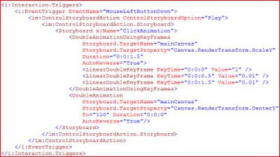
First, note the "i:Interaction.Triggers" tag. The "i:" is specifying that we are using an object in the System.Windows.Interactivity namespace that we referenced above. Next, we define our Event Trigger (also in the "i" namespace) and specify that it will act on the MouseLeftButtonDown event.
Now, we move on to the "im:ControlStoryboardAction" tag. The "im:" is referencing the Microsoft.Blend.Interactions namespace. This is denoting that we want to "Play" the Storyboard when the EventTrigger fires. Finally, we'll define the actual Storyboard in the "ControlStoryboardAction.Storyboard" section.
This contains a standard-looking Animation storyboard that we have named "ClickAnimaton". Let's look at each of the 2 animations in a little more detail.
The "DoubleAnimationUsingKeyFrames" says that we want to animate a double property (in this case the Y-Scale of the Canvas) and that we want to use KeyFrames to control the flow of the animation. The "Storyboard.Target" tells what object the storyboard is acting on (the Canvas in our Template), and the "Storyboard.TargetProperty" tells what property we are acting on. As noted before, we are operating on the Y-Scale of the Canvas by using the RenderTransform we defined earlier. Duration is 1.5 seconds and Auto-Reverse is true. This means that our total animation will be 3 seconds long.
Here's how we want our animation to work: first, we want it to "fall over" quickly (in 0.5 seconds), then stay "laying down" for a while, then pop back up quickly (also 0.5 seconds). They KeyFrames will let us do this. In the first "LinearKeyFrameAnimation", we are giving the starting position of 1, meaning set y-scaling to 100%. In the next, we want the y-scale to be set to 1% (almost invisible) at the half-second mark. The third shows that we want the y-scale to sill be at 1% at the 1.5 second mark. The auto-reverse runs the animation backwards (starting with the third KeyFrame and working up). This gives us a total animated time of 3 seconds.
The second animation is required because the origin of the Canvas is at the Top Left. This means that if we only had the first animation, the target would shrink up (toward the origin). The second animation says that we want to move the center point of the Canvas down so that it will shrink down and "fall over".
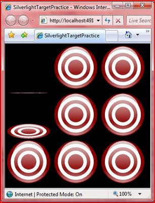
You'll have to run it yourself to see the final result. Here's a screen shot of things in action:
(Click image to enlarge)
Round Up
So, Silverlight 3 allows us to do much more in the XAML than Silverlight 2 allowed. We were able to reproduce the WPF XAML sample with a few changes. I expect that by the time .NET 4.0 and the next version of WPF rolls around, that WPF and Silverlight will look pretty much the same. But we'll still have to wait and see with that.
This is a good example of the power of declarative programming with XAML. The more I use it, the more I like it. When I think about trying to do an application like this in WinForms, I just shudder. It would be a mess of custom drawing code, timers, and crazy calculations. XAML gives me the freedom to easily take control over the layout and appearance of my application. And as we've seen here, it's not just limited to "look and feel", we can also program quite a bit of functionality with it.
You can add some code-behind and create a full fledged shooting gallery game that keeps track of scores and gives you a time limit. But I'll leave that as an exercise for the reader.
Happy coding!
The good new is that Silverlight 3 has additional support that allows us to replicate the XAML-only version of the application. It does vary a little bit from the WPF version, so even if you've looked through the previous post, you're likely to learn something new. I'll point out the differences as we come across them.
Scenario
We'll be creating a simple shooting gallery-type application. I call it "Target Practice" since it will require some more work to turn it into an actual game. In the final version, we will have a 3 x 3 grid of targets. Each of these is clickable adn will result in a "hit" animation. After 3 seconds, the target will reset to its previous state -- all inside the XAML. You can scroll down to the bottom to see the finished product.
Step 1 - Application Set-Up
We'll start by creating a new Silverlight 3 application. You'll need Visual Studio 2008, plus the Silverlight 3 bits (start here if you need them: http://silverlight.net/GetStarted/). Create a new project by selecting File -> New -> Project. From there, choose the "Silverlight" category under "Visual C#" and then select "Silverlight Application". I named my application "SilverlightTargetPractice".
You'll be asked if you want to create a web application to host the project. Go ahead and leave the defaults (create a new ASP.NET Web Site). This will give you 2 projects: "SilverlightTargetPractice" is your Silverlight application, and "SilverlightTargetPractice.Web" is the hosting web site. Whenever you run the project, you will want to run the web application.
In the Silverlight project, you will find the "MainPage.xaml" file. That's where we are going to start. Open up the xaml file, and you'll see the xaml editor. Note: There is no Silverlight 3 designer support in Visual Studio 2008; for that, you'll need Expression Blend 3. You can see my notes on this in a previous post. Here's the default page the project template creates:
(Click image to enlarge)

We're going to make a couple changes in the "UserControl" tag. Update the following properties:
d:DesignWidth="335"
d:DesignHeight="335"
Next, we'll replace the Grid with a set of nested StackPanels. The nested StackPanels will set up our 3 x 3 grid. As mentioned in the previous post, you can use a Grid here if you'd like, but I chose the StackPanels to keep the Button tags a little "cleaner". For the outer StackPanel, I set the Background to Black. Inside each of the nested StackPanels, I have placed 3 buttons. The buttons have fairly arbitrary names; this is just so we can tell them apart when we're doing the design work. The updated XAML looks like this:
(Click image to enlarge)

If you build and run the application at this point, you'll see this result. (Remember to run the Web application).
(Click image to enlarge)

Step 2 - Templates
Now we're going to take advantage of the "lookless" controls in XAML and replace the default Button template. This will allow us full control over the way our buttons look and behave. This varies a little bit from the WPF sample: in the WPF sample, I used a combination of Templates and Styles; in this sample, we'll use only a Template.
We'll start our Template by adding a local resource to the file. Add a tag "UserControl.Resources" just above the outer StackPanel. As we've seen before, Visual Studio IntelliSense is very helpful when hand-editing XAML; so, let the code-completion do a lot of the work for you. You can also do this entire application in Expression Blend, but that's a lesson for another time. Inside the Resources section, we'll add a ControlTemplate for our buttons.
(Click image to enlarge)

A few key things to point out. The TargetType is set to Button. This means that we can apply this template to Button controls (or their descendents) and only Button controls. Next is the x:Key. This gives a name to the Template that we can use to assign it elsewhere. Next we have a Canvas (our drawing surface with a Margin to space things out a little) and an Ellipse (which is just a DarkRed circle at this point). Note: the Ellipse is named "Outer Red Stripe" in the comments because we will be adding more to this template in just a bit.
Now we'll need to apply our new Template to our Buttons. We do this by assigning the Template property of each button to the StaticResource that we just created. The highlighted code below is repeated for each button.
(Click image to enlarge)

Here's our result (ignore the jpeg artifacts in the picture; it actually looks much better in person):
(Click image to enlarge)

Something to note: the red circles are still buttons. They are clickable (although they don't visibly change when you click on them), and they have standard button events (such as Click). Notice that the Content does not appear in the buttons. This is because our Template does not have a ContentManager, nor do we need one for this application. Because we aren't displaying the Content, we can remove the Content properties from each of our buttons to clean up the code.
Now, let's spice up our visuals.
Step 3 - Eye Candy
Now we'll take the boring red circles and make them into glassy 3-D buttons. As I mentioned in the WPF XAML sample, the best way to learn how to do this is by looking at some Photoshop tutorials. The same techniques (gradient opacity ellipses) can be used in Expression Blend. I take no credit for the "glow" parts of the design template; I copied them from a demo by Walt Ritscher. He's also a good resource for WPF styles and templates.
First, the top glow. This is simply added to our Control Template below the "Outer Red Stripe" code. It is just an ellipse with a radial gradient that moves from white to transparent.
(Click image to enlarge)

The bottom glow is much the same: just an ellipse with a radial gradient. We'll put this directly below the "Top Glow" code.
(Click image to enlarge)

If you build and run the application now, you'll see a distinct difference compared to what we had before:
(Click image to enlarge)

Cool, huh?
Step 4 - Completing the Targets
Next, we just need to complete the visual design of the Targets. This is just a set of ellipses, each smaller than the last, alternating between Red and White.
(Click image to enlarge)

A few things to note here. First you'll see that we are moving the Canvas.Left and Canvas.Top properties because the Top Left corner is considered to be the starting point for drawing on a Canvas. We are moving down and a bit to the right to keep the smaller circle centered on the previous one.
Order is important here. The XAML parser processes items in the order that they appear in the file. This means that the "Outer Red Stripe" is drawn first, and then each smaller circle is drawn on top of it. The same is true of the "glows". We want these on top of the rest, so we specify them last in the file. The Canvas in Silverlight 3 does have a Z-Order property, so you can adjust this if you have a more complex drawing.
We're done with the visuals for our Targets. Now they look like this:
(Click image to enlarge)

Step 5 - The Action
The last step is to add the behavior. This entire section is quite a bit different from the WPF sample, and all brand new to Silverlight 3.
As a reminder, when we click on any of the target buttons, we want it to animate by "falling over" and then reset after 3 seconds. The animation will work by using a Transform. The first step is to define an empty Transform to our Canvas. I have this inside the closing Canvas tag, but below all of the visuals we added above.
(Click image to enlarge)

This is where things really start to get interesting. For the Animation to be triggered by a Click, we need to add some References to our project: Microsoft.Expression.Interactions and System.Windows.Interactivity (noted below).
(Click image to enlarge)

Now we need to add a namespace reference to these assemblies. We add these at the top of the file with the other "xmlns" references. The good news is that you don't have to type all of this in (see the image below). Instead, IntelliSense will help you out. After you type the "=", you will get a pop-up of the assmeblies that are available from the project references. The completed namespace references should look like the image below:
(Click image to enlarge)

Next, we'll add an Interaction section to the Template that includes an EventTrigger. This needs to be placed before the closing Canvas tag. (I have it between the Transform and the end of the Canvas.) The EventTrigger specifies that it acts on the "MouseLeftButtonDown" event. And inside of that, we have an Animation Storyboard. Take a look at the EventTrigger and Animation specified below. Then we'll walk through it step by step.
(Click image to enlarge)

First, note the "i:Interaction.Triggers" tag. The "i:" is specifying that we are using an object in the System.Windows.Interactivity namespace that we referenced above. Next, we define our Event Trigger (also in the "i" namespace) and specify that it will act on the MouseLeftButtonDown event.
Now, we move on to the "im:ControlStoryboardAction" tag. The "im:" is referencing the Microsoft.Blend.Interactions namespace. This is denoting that we want to "Play" the Storyboard when the EventTrigger fires. Finally, we'll define the actual Storyboard in the "ControlStoryboardAction.Storyboard" section.
This contains a standard-looking Animation storyboard that we have named "ClickAnimaton". Let's look at each of the 2 animations in a little more detail.
The "DoubleAnimationUsingKeyFrames" says that we want to animate a double property (in this case the Y-Scale of the Canvas) and that we want to use KeyFrames to control the flow of the animation. The "Storyboard.Target" tells what object the storyboard is acting on (the Canvas in our Template), and the "Storyboard.TargetProperty" tells what property we are acting on. As noted before, we are operating on the Y-Scale of the Canvas by using the RenderTransform we defined earlier. Duration is 1.5 seconds and Auto-Reverse is true. This means that our total animation will be 3 seconds long.
Here's how we want our animation to work: first, we want it to "fall over" quickly (in 0.5 seconds), then stay "laying down" for a while, then pop back up quickly (also 0.5 seconds). They KeyFrames will let us do this. In the first "LinearKeyFrameAnimation", we are giving the starting position of 1, meaning set y-scaling to 100%. In the next, we want the y-scale to be set to 1% (almost invisible) at the half-second mark. The third shows that we want the y-scale to sill be at 1% at the 1.5 second mark. The auto-reverse runs the animation backwards (starting with the third KeyFrame and working up). This gives us a total animated time of 3 seconds.
The second animation is required because the origin of the Canvas is at the Top Left. This means that if we only had the first animation, the target would shrink up (toward the origin). The second animation says that we want to move the center point of the Canvas down so that it will shrink down and "fall over".
You'll have to run it yourself to see the final result. Here's a screen shot of things in action:
(Click image to enlarge)

Round Up
So, Silverlight 3 allows us to do much more in the XAML than Silverlight 2 allowed. We were able to reproduce the WPF XAML sample with a few changes. I expect that by the time .NET 4.0 and the next version of WPF rolls around, that WPF and Silverlight will look pretty much the same. But we'll still have to wait and see with that.
This is a good example of the power of declarative programming with XAML. The more I use it, the more I like it. When I think about trying to do an application like this in WinForms, I just shudder. It would be a mess of custom drawing code, timers, and crazy calculations. XAML gives me the freedom to easily take control over the layout and appearance of my application. And as we've seen here, it's not just limited to "look and feel", we can also program quite a bit of functionality with it.
You can add some code-behind and create a full fledged shooting gallery game that keeps track of scores and gives you a time limit. But I'll leave that as an exercise for the reader.
Happy coding!
Sunday, August 2, 2009
Silverlight 3 -- D'oh! and Woo Hoo!
In July, Microsoft released Silverlight 3. On the one hand, it's good to see the features moving forward at a good pace. On the other hand, we only had 9 months with Silverlight 2. I just thought I was starting to understand how to work with Silverlight 2 effectively, and wham! new version.
The Bad
First, the bad. I was surprised by some of the items that are included in the Silverlight 3 release notes. Fortunately, I read these before installing the bits.
1. Silverlight 2 & Silverlight 3 compatability
There are some blog posts out there with tips on how to switch back and forth between the 2 versions, but it's making things a bit more complicated than I would like. So, the work machine stays on Silverlight 2 (but Silverlight 3 immediately gets installed at home).
2. Design Preview in Visual Studio 2008
There are other notes as well, and I would encourage you to read them in full. These are the ones that jumped out at me as being disappointments.
The Good
So, now the good parts. These are just the items that struck me as useful. There are plenty of other new features (such as out-of-browser support and 3-D support that are interesting but not very applicable in my world).
1. WCF Service Support
Silverlight 3 has support for the full WCF stack. This means that we are no longer limited to basicHttpBinding for our WCF services that are consumed by Silverlight. We can use WS* bindings or any of the other bindings.
2. Controls
In addition, there are plenty of new contols available (including a TreeView) and loads of new layout controls. The Silverlight 3 toolbox is starting to look a lot closer to the WPF toolbox (and excels it in a few cases).
3. Improved XAML
New features such as Behaviors and Triggers greatly enhance the ability to define things declaratively in XAML as opposed to having to implement them in code.
Here's my example: One of my first demos on this blog was a WPF application that was written entirely in XAML. It included a visual re-design of buttons and animation that triggered by clicking the button. It was fully functional with absolutely no code-behind. You can see that entry here: WPF Target Practice.
When I first started getting into Silverlight 2, my goal was to reproduce the same application in Silverlight. However, due to limitations (specifically a lack of Triggers), the only way to implement the animation would be in code. I moved forward with learning how to do the animation that way (and implemented some pretty cool visuals in my application at work), but I never posted the results since they missed the goal of using XAML only.
The Bad
First, the bad. I was surprised by some of the items that are included in the Silverlight 3 release notes. Fortunately, I read these before installing the bits.
1. Silverlight 2 & Silverlight 3 compatability
Silverlight 2 projects cannot be created with the Silverlight 3 Tools for Visual Studio 2008. To create Silveright 2 projects, uninstall the Silverlight 3 runtime and the Silverlight 3 Tools from Add or Remove Programs and re-install the Silverlight 2 Tools for Visual Studio 2008.This was a showstopper for me at work. As I've mentioned, I've been developing a Silverlight 2 application at my day job. Due to certain circumstances, I can't upgrade the project to Silverlight 3 (yet). Since I still need to support it in the meantime, I need to keep the Silverlight 2 bits installed on my machine.
There are some blog posts out there with tips on how to switch back and forth between the 2 versions, but it's making things a bit more complicated than I would like. So, the work machine stays on Silverlight 2 (but Silverlight 3 immediately gets installed at home).
2. Design Preview in Visual Studio 2008
Due to performance and rendering issues, the preview window has been disabled in the Silverlight 3 Tools for Visual Studio 2008. The functionality of the XAML editor remains intact, including IntelliSense, error messages, and the ability to drag controls from the Toolbox into the editor. WYSIWYG XAML design can be done by using Expression Blend or Visual Studio 2010.This limitation is somewhat disappointing to me. I'm a XAML guy. I'm comfortable typing in the design code directly (and IntelliSense works great in Visual Studio). But I did use the preview window to see how things look. Now, I have to have Expression Blend open to check the preview. I wouldn't mind so much if I used Blend more extensively (which I probably should anyway), but right now it seems like a bit of a kludge to have to toggle back and forth.
There are other notes as well, and I would encourage you to read them in full. These are the ones that jumped out at me as being disappointments.
The Good
So, now the good parts. These are just the items that struck me as useful. There are plenty of other new features (such as out-of-browser support and 3-D support that are interesting but not very applicable in my world).
1. WCF Service Support
Silverlight 3 has support for the full WCF stack. This means that we are no longer limited to basicHttpBinding for our WCF services that are consumed by Silverlight. We can use WS* bindings or any of the other bindings.
2. Controls
In addition, there are plenty of new contols available (including a TreeView) and loads of new layout controls. The Silverlight 3 toolbox is starting to look a lot closer to the WPF toolbox (and excels it in a few cases).
3. Improved XAML
New features such as Behaviors and Triggers greatly enhance the ability to define things declaratively in XAML as opposed to having to implement them in code.
Here's my example: One of my first demos on this blog was a WPF application that was written entirely in XAML. It included a visual re-design of buttons and animation that triggered by clicking the button. It was fully functional with absolutely no code-behind. You can see that entry here: WPF Target Practice.
When I first started getting into Silverlight 2, my goal was to reproduce the same application in Silverlight. However, due to limitations (specifically a lack of Triggers), the only way to implement the animation would be in code. I moved forward with learning how to do the animation that way (and implemented some pretty cool visuals in my application at work), but I never posted the results since they missed the goal of using XAML only.
Silverlight 3 has some additional assemblies available that allow you to implement the triggers and fire off animations. So, in an entry in the near future, I'm planning on posting the Silverlight 3 version of Target Practice. So be sure to stay tuned!
Installation
To use Silverlight 3, you'll need Visual Studio 2008, plus the Silverlight 3 bits. Start at the Silverlight site here: http://silverlight.net/GetStarted/. As mentioned above, you want Expression Blend 3 (there are trials available if you don't want to purchase the full suite). Be sure to take a thorough look through the release notes as well.
Wrap Up
So, like most things in life, there is the bad along with the good. I'm hoping that by the time Visual Studio 2010 comes out, we'll have some better options available. In the meantime, the Silverlight 3 does have a lot to offer (I just scratched the surface with a few items that interested me).
Keep learning!
Saturday, June 13, 2009
More Silverlight Part 2 - User Controls & Events
The story so far: In More Silverlight Part 1, we created a Silverlight 2 application and a WCF service. We then used a DataTemplate and various ValueConverters to format and display the data in the ListBox.
Here's what the app looked like when we left off:
(Click image to enlarge)

Now, we're going to move on, first by creating a Detail panel, then abstracting out the ListBox to a User Control, and finally creating an Event that will let us know when a new Person record is selected.
Creating a Detail Panel
We'll start by adding a Detail panel that shows the First Name, Last Name, Birth Date, and Age for a single Person (the Person selected in the ListBox). This will be a StackPanel that is in the 2nd column of the Grid in our Page.xaml.
(Click image to enlarge)

The code is pretty self-explanatory. We set up TextBlocks to serve as labels for the data, and TextBlocks with data binding to hold the data. You'll notice that we are using the same DateConverter and AgeConverter that we used in the ListBox.
Getting Data into the Detail Panel
We want the Detail Panel to update whenever the selection changes in the ListBox. To do this, we'll hook up a "SelectionChanged" event to the ListBox. As a reminder, you can just type "SelectionChanged=" and Visual Studio will give you the option to add a New Event Handler.
(Click image to enlarge)

Now, we'll navigate to the Event Handler in the Page.cs file. What we need to do here is set the DataContext of the DetailPanel. But the question is, what should we bind to? Do we need to make a service call?
The answer comes through the fact that Silverlight data binding is extremely flexible. We can bind to any object, including an object that exists somewhere else on the page. In this case, we want to bind to the Person that is selected in the ListBox. So, we do just that.
(Click image to enlarge)

A couple of things to note here. First, you see that we are getting the SelectedItem for the ListBox and then casting it as a Person. What you should be aware of is that this may result in a null value. The SelectionChanged event will fire whenever the currently selected item changes; this includes when an item is un-selected. When a ListBox is first loaded, the default is to have no selection. This event will fire, and the SelectedItem will be null.
In many circumstances, you will want to check the "var p" to see if it is null after the assignment. In our case, we will want to let p be null (we'll see why in just a bit).
After we get the SelectedItem cast as a Person, we just assign this as the DataContext of our DetailPanel. Pretty straightforward, huh? Here's the result:
(Click image to enlarge)

To see how the nulls are handled in the Event, simply click the Button again. This will clear the selected item in the ListBox, which will in turn clear out the DetailPanel data.
Creating a User Control
But what if we want to re-use the Person ListBox multiple places in our application? Rather than duplicating code, it would be better to abstract out this piece as a separate User Control. That's what we'll do right now.
Step 1: Add a new User Control to the Silverlight project
Right-click on the Silverlight project, select "Add", then "New Item". From the dialog, select "Silverlight User Control" and name it "PersonListControl". This will create a default PersonListControl.xaml and PersonListControl.cs that look very similar to what we started with for Page.xaml/Page.cs. This is because Page is also a Silverlight User Control.
Step 2: Cut the StackPanel xaml from Page.xaml to PersonListControl.xaml
We'll be moving everything from the first Grid column of Page.xaml to the new user control. Just cut the entire StackPanel (the one that has Grid.Column="0"), and paste it over the Grid (LayoutRoot) in PersonListControl.xaml. This will leave us with a StackPanel as the root element of the user control. Note: after pasting it in, you will want to remove the "Grid.Column" attribute. The app will still run with it there, but it's better to keep the xaml as clean as possible.
Step 3: Copy the UserControl.Resources Section
The xaml that we moved in the step above makes use of the Converters we created earlier. This means that our new user control needs to have references to these as well. The easiest way is just to copy these from the Page.xaml. Note that we are doing a copy (not a cut) because these are used in the DetailPanel that is staying on Page.xaml.
Copy the "xmlns:local=" namespace and the entire "UserControl.Resources" sections with all three converters to PersonListControl.xaml.
Step 4: Change the Size
Our new UserControl will need to fit in the first column of our main Grid, so we'll want to change the sizes a bit. Change Width to 240 (to allow for a little bit of padding) and the Height to 300.
Step 5: Move the Event Handlers
The xaml that we moved contained 2 Event Handlers: one for the ListBox selection changed event, and one for the Button click event. Now we'll move the Event Handlers as well.
From the Page.cs file, cut the "PersonList_SelectionChanged" and "GetPeopleButton_Click" methods and paste them into PersonListControl.cs. One thing to note: since the PersonList_SelectionChanged event directly references the DetailPanel, this won't compile. For now, just comment out the 2 lines in this Event Handler. We'll be re-implementing this a little later.
You should be able to build now, but if you run the application, you will find that we still need to place the new user control onto our main Page.
Step 6: Using the User Control
Actually using the new user control on our main Page couldn't be easier. In the spot in our Page.xaml where we used to have a StackPanel (in the first Grid column), we will now have our control:
(Click image to enlarge)

Notice that this uses the "local" prefix (the same as our Converters) since everything is in the same namespace. If we were to split out the User Control into a separate namespace, then we would need to add a new xmlns and give it a different alias to use.
We can now run the application, and the ListBox will look just like it did before. If we click the Button, it will fetch the Person list and display it. The application doesn't work completely, though. We can't get the data into the DetailPanel. For that, we will need to expose an Event in our new User Control.
High Level Event Overview
Before we create the Event, let's take a look at how we'd like it to work. What we want to do is get the Person that is selected in the ListBox and display it in the DetailPanel. The problem is that the ListBox and DetailPanel are now in different scopes. So, we need to get the Person from the ListBox to the DetailPanel somehow. We'll do this by exposing an Event in the ListBox that has the selected Person as part of the EventArgs.
We'll need a custom EventArgs class that will hold the selected Person. Then we'll set up an Event on our new User Control that we can hook in to from our Page.
Custom EventArgs
We'll create the custom EventArgs class in the PersonListControl.cs file. You may want to abstract this out into its own file for other projects, but we won't do that here. We'll descend from RoutedEventArgs (which is a little more specific than EventArgs and is commonly used in Silverlight and WPF). Our custom EventArgs only needs to have a single Property (SelectedPerson) and a contructor that takes a Person as a parameter. Here's the completed code:
(Click image to enlarge)

Declaring the Event Handler
Next, we need to declare the Event in our PersonListControl class. We can do this with a single line of code:
(Click image to enlarge)

Note that there are several ways to make this declaration, including using "delegate" syntax. The syntax used here is the most compact. You'll see that we are using our custom EventArgs class as a generic type. Our Event is called "SelectedPersonChanged".
Invoking the Event Handler
To invoke the Event Handler, the convention is to create a method called OnEventName -- in our case "OnSelectedPersonChanged". Take a look at the code below:
(Click image to enlarge)

If the comments look familiar, it's because they came straight from the Microsoft Help file. They aren't really applicable for this particular application because we're not making descendant classes or doing complex invokation, but it's good to use the "safe" version so that we can get used to it.
You'll see that we are using our custom EventArgs as a parameter for this method. And as noted in the comments, we are making a copy of the handler first. This is because we can only invoke handlers that are actually hooked up to something (i.e. not null). If the handler is null, then we do not want to do anything (and thus we have the null check). The reason that we make the copy is that it is possible that the handler is deleted between the time we check for null and the time we invoke the method. If we make a copy, then we are acting on a snapshot in time, and so eliminate this possibility.
Raising the Event
Now we need to actually raise the event. We will do this in the "PersonList_SelectionChanged" method (the one that we commented out earlier). We will get the SelectedItem from the ListBox and cast it to a Person -- just like the old ListBox SelectionChanged handler. Then we'll use that Person to create the custom EventArgs and pass it to the OnSelectedPersonChanged method.
(Click image to enlarge)

Notice that it is possible for the Person to be null (as we discussed above). This is okay. If there is no SelectedItem, then we will pass the null through the Event and ultimately to the DetailPanel (as we'll see next). Be sure to build everything to make sure that there are now errors. If you run, you still won't see any difference. Yet.
Using the Newly Exposed Event
Now we'll go back to our Page.xaml to hook up the new Event. You'll notice that if you start typing "Select" in the PersonListControl element, IntelliSense will show the Event. Like other events, if you type "SelectedPersonChanged=", Visual Studio will let pop up "New Event Handler" (as we saw above). If you do this, you'll end up with something like this:
(Click image to enlarge)

Finally, we'll navigate to the event handler in the Page.cs file. Since the custom EventArgs exposes a SelectedPerson object, we just need to assign this to the DataContext of the DetailPanel.
(Click image to enlarge)

If you run the application now, you'll see a fully functioning Person ListBox and DetailPanel.
(Click image to enlarge)

This will behave the same as above. If you click the Button again, the DetailPanel is cleared. This is because the SelectedItem is cleared when the ListBox is loaded. Because the SelectedItem changed, the Event fires. And because there is no SelectedItem, the EventArgs contains a null SelectedPerson. This results in a null for the DataContext for the DetailPanel (which is what we want here). You may need to rework this if you need different behavior.
Summary
We've taken our application and abstracted out a significant part of it into a separate User Control. Then we implemented an Event on that User Control that we can use when we add the element to our Page. If we were to have several different forms that needed this same Person ListBox, we can simply add the custom User Control and get all the same functionality. We even have an Event to hook into so we know when the selected Person changes. These are just the basics, of course. For a production app, we would want to add Error handling and other such things.
As you can see, Silverlight has several powerful features that allow us to create flexible and well-designed applications. Since pretty much everything in Silverlight is a User Control, it's possible to nest these elements within each other and come up with some interesting abstractions in our UI.
Happy Coding!
Saturday, June 6, 2009
More Silverlight Part 1 - Data Templates & Value Converters
I've pretty much finished up my Silverlight 2 project at work, so I thought I'd share a few more useful things that I've come across. This time, we'll take a look at Data Templates (which make List Boxes extremely flexible) and Value Converters.
Setting Up the App
We're going to start by building a application similar to what we built in the last few posts: a Silverlight 2 application that gets data from a WCF service. Start by following Steps 1 - 3 from this post. I'll point out where we'll make a couple of changes.Step 1: Create a New Silverlight Application
We'll call it "TemplatesConvertersEvents" this time. Let it create the ASP.NET hosting site as well.
Step 2: Build a WCF Service
Step 2a: The WCF Service Contract
We'll create the same PersonService, but we'll add a new field "BirthDate" to the Person class. See the Service Contract below:
(Click image to enlarge)

Step 2b: The Service Implementation
Again, this will look pretty similar. We'll just add a BirthDate value to each of the Person objects.
(Click image to enlarge)

Step 2c: WCF Service Configuration
Same as last time. Make sure to change the binding from "wsHttpBinding" to "basicHttpBinding".
Step 3: Add the WCF Service Reference to the Silverlight Application
Step 4: Update the XAML.
This is pretty similar to the previous examples, with just a few differences. Check out the code sample below for Page.xaml. Then we'll walk through it.
(Click image to enlarge)

Start by changing the Width and Height properties of the page (500 x 300). Then replace the default Grid with a Border. The Border contains a 2 column grid. We'll be concentrating on the first column here (the 2nd column will be used in Part 2). The Grid contains a ListBox.
Notice that the ListBox looks a little different. We are no longer using the "DisplayMemberPath". Instead, we have an ItemTemplate that contains a DataTemplate. The DataTemplate is simply a container that can hold whatever content you like. For now, we'll just include a TextBlock that is bound to the FirstName field. This will have the same effect as if we were to set the DisplayMemberPath. One thing to be aware of: the DisplayMemberPath and ItemTemplate are mutually exclusive; if you try to include both, you will get an error.
Finally, we have a Button that looks similar to our previous examples. As a reminder, to add the Click handler, just type "Click=" and Visual Studio will pop up an option for "New Event Handler". This will create a handler based on the control name and put the stub in the code-behind.
Next we implement the handler. You can right-click on "GetPeopleButton_Click" and choose "Navigate to Event Handler" and it will take you to appropriate spot in Page.cs. The handler implementation should look like this (again similar to what we've seen before):
(Click image to enlarge)

Another reminder: you will need to add the "using" statement for the PersonService. If you type in the code above, you can place the cursor on "PersonServiceClient", then press Ctrl+. to bring up the option to add the "using".
You should be able to build and run the application now. After you click the button, the results should look like this:
(Click image to enlarge)

Expanding the Data Template
Now we'll see the power that the ListBox has by expanding the DataTemplate a bit. The DataTemplate can only have a single child element, so if we add multiple items, we'll need to wrap them in some sort of container. We'll use a set of nested StackPanels -- some vertical and some horizontal.
(Click image to enlarge)

This is fairly straightforward XAML. Note that we have multiple TextBlocks that are databound and a little bit of formatting. Here's what we get when we run the app now.
(Click image to enlarge)

Creating a Value Converter
One thing I don't like about the output is the format of the BirthDate field. To take care of this, we'll use a value converter. A value converter is simply a class that implements the IValueConverter interface (profound, eh?). The interface consists of 2 methods: Convert and ConvertBack. An incoming value is passed in as a parameter; all you need to do is do the conversion and return the new value.
Our DateConverter isn't going to be that interesting, but it's a good place to start (then we'll look at something a little more challenging).
In the Silverlight project, add a new Class. I've called mine "Converters.cs" because I'll use the same file to hold all of my converters. Then we'll rename the class from "Converter" to "DateConverter" and add the IValueConverter interface. IValueConverter is in the System.Windows.Data namespace, so you'll need to add this to the "using" block as well.
As we've done before, we'll just right-click on "IValueConverter", choose "Implement Interface", then "Implement Interface" again. This will put the "Convert" and "ConvertBack" method stubs into our class. We'll only be doing one-way conversion (read-only data), so we will only implement "Convert". If you had a TextBox or other editable control, then you would also implement "ConvertBack" which reverses the process. Here's our code:
(Click image to enlarge)

Since the "value" parameter is of type object, we'll need to start off by casting it to the inbound type that we are expecting (DateTime in this case). Our outbound type is simply a string, so we'll call the ToString function with a formatting string that we like. Note that there are additional options (some that are especially useful for Date conversions) by using the "parameter" and "culture" parameters. Take a look at the Microsoft Help file to get more information on those.
Using a Value Converter
So, now that we have a DateConverter, how do we use it? First, we'll need to add the namespace to our xaml (see below). Again, VisualStudio is helpful here; if you type "xmlsns:local=", then you will get a list of namespaces that are in the project, including everything that appears in the project References. We'll select the project namespace "TemplatesConvertersEvents". You can use whatever alias you like for the namespace; "local" is a convention for items contained within your project.
The next step is to add our DateConverter as a Static Resource.
(Click image to enlarge)

Now all that's left is to add the Converter to the Binding declaration in our TextBlock.
(Click image to enlarge)

If you run the application now, you'll see that we have a nicely formatted mm/dd/yyyy date for the BirthDate field. Let's try something a little more complex.
An Age Converter
In addition to the BirthDate, I'd like to display the age of the Person as well. The problem is that we don't have an Age field. So, instead, we'll use the BirthDate field to calculate the age. We'll just add another class (AgeConverter) to the Converters.cs file.
(Click image to enlarge)

We won't worry about the specifics of the code too much (I'm sure that I'll get letters with better ways to calculate age). The main point is that we are taking a DateTime (BirthDate) and converting it to an Integer (Age). Well, actually, we're converting it to a string for display purposes, but you get the idea.
Using the AgeConverter is just the same as the DateConverter. Add a Static Resource (I called mine "myAgeConverter") and then use it in a Binding statement. Notice that we are still Binding to the BirthDate field; by using the AgeConverter, we control what we will actually display. Here is a portion of our expanded DataTemplate (we appended the Age portions to the section with the BirthDate).
(Click image to enlarge)

If you run the app now, you'll see both the BirthDate and the Age are included.
One More Converter
As one final step, we'll get a little more creative with our converter. So far, we've more or less just converted a value from one format to another. This time, we'll convert to a completely different type. I want to display ages that are over 30 in a green font and 30 or under in blue. We'll do this by changing the BirthDate to a Brush.
Once again, create a new class "AgeBrushConverter" in the Converter.cs file. The code looks like the "AgeConverter" code, but instead of returning the age, it uses it to create a SolidColorBrush:
(Click image to enlarge)

For the implementation, our final "Resources" section looks like this:
(Click image to enlarge)

And our final DataTemplate (notice that we are using the AgeBrushConverter for the Foreground property of the TextBlock):
(Click image to enlarge)

And our final result:
(Click image to enlarge)

Summary
We've taken a chance to look at DataTemplates and ValueConverters to add flexibility to how we display our data in ListBoxes. DataTemplates can contain complex layouts (including Grids and Images, if desired). ValueConverters also go beyond simple formatting (like Dates and Currency); they can also be used to show or hide items (think of Binding a value to the "Visible" property) or even to add text formatting to differentiate values (such as using red for negative numbers and black for positive, or possibly graying-out inactive items).
Hang on to this application. In Part 2, we'll take a look at creating a custom user control that abstracts out part of the functionality and exposes an event that we can use.
Subscribe to:
Posts (Atom)