The good new is that Silverlight 3 has additional support that allows us to replicate the XAML-only version of the application. It does vary a little bit from the WPF version, so even if you've looked through the previous post, you're likely to learn something new. I'll point out the differences as we come across them.
Scenario
We'll be creating a simple shooting gallery-type application. I call it "Target Practice" since it will require some more work to turn it into an actual game. In the final version, we will have a 3 x 3 grid of targets. Each of these is clickable adn will result in a "hit" animation. After 3 seconds, the target will reset to its previous state -- all inside the XAML. You can scroll down to the bottom to see the finished product.
Step 1 - Application Set-Up
We'll start by creating a new Silverlight 3 application. You'll need Visual Studio 2008, plus the Silverlight 3 bits (start here if you need them: http://silverlight.net/GetStarted/). Create a new project by selecting File -> New -> Project. From there, choose the "Silverlight" category under "Visual C#" and then select "Silverlight Application". I named my application "SilverlightTargetPractice".
You'll be asked if you want to create a web application to host the project. Go ahead and leave the defaults (create a new ASP.NET Web Site). This will give you 2 projects: "SilverlightTargetPractice" is your Silverlight application, and "SilverlightTargetPractice.Web" is the hosting web site. Whenever you run the project, you will want to run the web application.
In the Silverlight project, you will find the "MainPage.xaml" file. That's where we are going to start. Open up the xaml file, and you'll see the xaml editor. Note: There is no Silverlight 3 designer support in Visual Studio 2008; for that, you'll need Expression Blend 3. You can see my notes on this in a previous post. Here's the default page the project template creates:
(Click image to enlarge)

We're going to make a couple changes in the "UserControl" tag. Update the following properties:
d:DesignWidth="335"
d:DesignHeight="335"
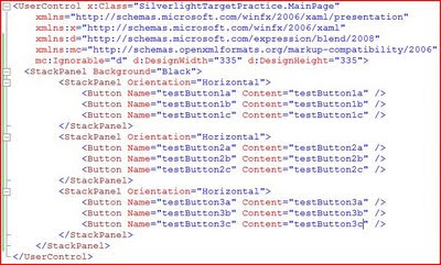
Next, we'll replace the Grid with a set of nested StackPanels. The nested StackPanels will set up our 3 x 3 grid. As mentioned in the previous post, you can use a Grid here if you'd like, but I chose the StackPanels to keep the Button tags a little "cleaner". For the outer StackPanel, I set the Background to Black. Inside each of the nested StackPanels, I have placed 3 buttons. The buttons have fairly arbitrary names; this is just so we can tell them apart when we're doing the design work. The updated XAML looks like this:
(Click image to enlarge)
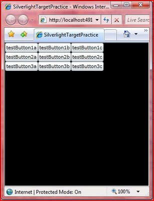
If you build and run the application at this point, you'll see this result. (Remember to run the Web application).
(Click image to enlarge)
Step 2 - Templates
Now we're going to take advantage of the "lookless" controls in XAML and replace the default Button template. This will allow us full control over the way our buttons look and behave. This varies a little bit from the WPF sample: in the WPF sample, I used a combination of Templates and Styles; in this sample, we'll use only a Template.
We'll start our Template by adding a local resource to the file. Add a tag "UserControl.Resources" just above the outer StackPanel. As we've seen before, Visual Studio IntelliSense is very helpful when hand-editing XAML; so, let the code-completion do a lot of the work for you. You can also do this entire application in Expression Blend, but that's a lesson for another time. Inside the Resources section, we'll add a ControlTemplate for our buttons.
(Click image to enlarge)
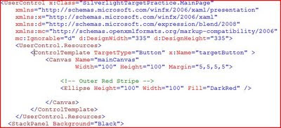
A few key things to point out. The TargetType is set to Button. This means that we can apply this template to Button controls (or their descendents) and only Button controls. Next is the x:Key. This gives a name to the Template that we can use to assign it elsewhere. Next we have a Canvas (our drawing surface with a Margin to space things out a little) and an Ellipse (which is just a DarkRed circle at this point). Note: the Ellipse is named "Outer Red Stripe" in the comments because we will be adding more to this template in just a bit.
Now we'll need to apply our new Template to our Buttons. We do this by assigning the Template property of each button to the StaticResource that we just created. The highlighted code below is repeated for each button.
(Click image to enlarge)
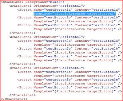
Here's our result (ignore the jpeg artifacts in the picture; it actually looks much better in person):
(Click image to enlarge)
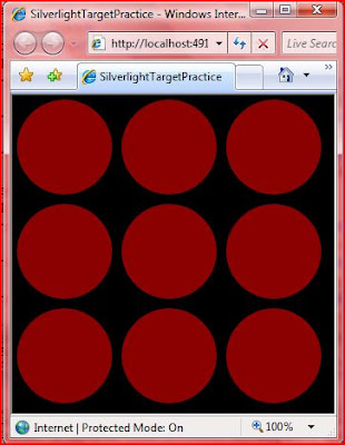
Something to note: the red circles are still buttons. They are clickable (although they don't visibly change when you click on them), and they have standard button events (such as Click). Notice that the Content does not appear in the buttons. This is because our Template does not have a ContentManager, nor do we need one for this application. Because we aren't displaying the Content, we can remove the Content properties from each of our buttons to clean up the code.
Now, let's spice up our visuals.
Step 3 - Eye Candy
Now we'll take the boring red circles and make them into glassy 3-D buttons. As I mentioned in the WPF XAML sample, the best way to learn how to do this is by looking at some Photoshop tutorials. The same techniques (gradient opacity ellipses) can be used in Expression Blend. I take no credit for the "glow" parts of the design template; I copied them from a demo by Walt Ritscher. He's also a good resource for WPF styles and templates.
First, the top glow. This is simply added to our Control Template below the "Outer Red Stripe" code. It is just an ellipse with a radial gradient that moves from white to transparent.
(Click image to enlarge)
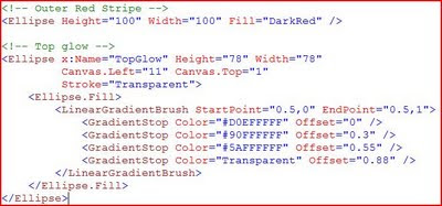
The bottom glow is much the same: just an ellipse with a radial gradient. We'll put this directly below the "Top Glow" code.
(Click image to enlarge)

If you build and run the application now, you'll see a distinct difference compared to what we had before:
(Click image to enlarge)
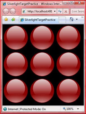
Cool, huh?
Step 4 - Completing the Targets
Next, we just need to complete the visual design of the Targets. This is just a set of ellipses, each smaller than the last, alternating between Red and White.
(Click image to enlarge)
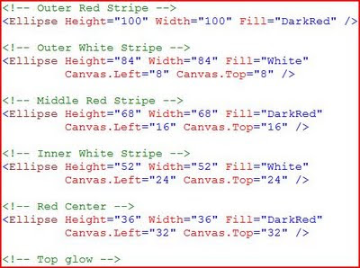
A few things to note here. First you'll see that we are moving the Canvas.Left and Canvas.Top properties because the Top Left corner is considered to be the starting point for drawing on a Canvas. We are moving down and a bit to the right to keep the smaller circle centered on the previous one.
Order is important here. The XAML parser processes items in the order that they appear in the file. This means that the "Outer Red Stripe" is drawn first, and then each smaller circle is drawn on top of it. The same is true of the "glows". We want these on top of the rest, so we specify them last in the file. The Canvas in Silverlight 3 does have a Z-Order property, so you can adjust this if you have a more complex drawing.
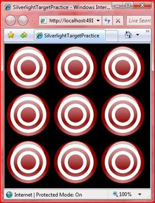
We're done with the visuals for our Targets. Now they look like this:
(Click image to enlarge)
Step 5 - The Action
The last step is to add the behavior. This entire section is quite a bit different from the WPF sample, and all brand new to Silverlight 3.
As a reminder, when we click on any of the target buttons, we want it to animate by "falling over" and then reset after 3 seconds. The animation will work by using a Transform. The first step is to define an empty Transform to our Canvas. I have this inside the closing Canvas tag, but below all of the visuals we added above.
(Click image to enlarge)

This is where things really start to get interesting. For the Animation to be triggered by a Click, we need to add some References to our project: Microsoft.Expression.Interactions and System.Windows.Interactivity (noted below).
(Click image to enlarge)

Now we need to add a namespace reference to these assemblies. We add these at the top of the file with the other "xmlns" references. The good news is that you don't have to type all of this in (see the image below). Instead, IntelliSense will help you out. After you type the "=", you will get a pop-up of the assmeblies that are available from the project references. The completed namespace references should look like the image below:
(Click image to enlarge)

Next, we'll add an Interaction section to the Template that includes an EventTrigger. This needs to be placed before the closing Canvas tag. (I have it between the Transform and the end of the Canvas.) The EventTrigger specifies that it acts on the "MouseLeftButtonDown" event. And inside of that, we have an Animation Storyboard. Take a look at the EventTrigger and Animation specified below. Then we'll walk through it step by step.
(Click image to enlarge)
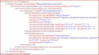
First, note the "i:Interaction.Triggers" tag. The "i:" is specifying that we are using an object in the System.Windows.Interactivity namespace that we referenced above. Next, we define our Event Trigger (also in the "i" namespace) and specify that it will act on the MouseLeftButtonDown event.
Now, we move on to the "im:ControlStoryboardAction" tag. The "im:" is referencing the Microsoft.Blend.Interactions namespace. This is denoting that we want to "Play" the Storyboard when the EventTrigger fires. Finally, we'll define the actual Storyboard in the "ControlStoryboardAction.Storyboard" section.
This contains a standard-looking Animation storyboard that we have named "ClickAnimaton". Let's look at each of the 2 animations in a little more detail.
The "DoubleAnimationUsingKeyFrames" says that we want to animate a double property (in this case the Y-Scale of the Canvas) and that we want to use KeyFrames to control the flow of the animation. The "Storyboard.Target" tells what object the storyboard is acting on (the Canvas in our Template), and the "Storyboard.TargetProperty" tells what property we are acting on. As noted before, we are operating on the Y-Scale of the Canvas by using the RenderTransform we defined earlier. Duration is 1.5 seconds and Auto-Reverse is true. This means that our total animation will be 3 seconds long.
Here's how we want our animation to work: first, we want it to "fall over" quickly (in 0.5 seconds), then stay "laying down" for a while, then pop back up quickly (also 0.5 seconds). They KeyFrames will let us do this. In the first "LinearKeyFrameAnimation", we are giving the starting position of 1, meaning set y-scaling to 100%. In the next, we want the y-scale to be set to 1% (almost invisible) at the half-second mark. The third shows that we want the y-scale to sill be at 1% at the 1.5 second mark. The auto-reverse runs the animation backwards (starting with the third KeyFrame and working up). This gives us a total animated time of 3 seconds.
The second animation is required because the origin of the Canvas is at the Top Left. This means that if we only had the first animation, the target would shrink up (toward the origin). The second animation says that we want to move the center point of the Canvas down so that it will shrink down and "fall over".
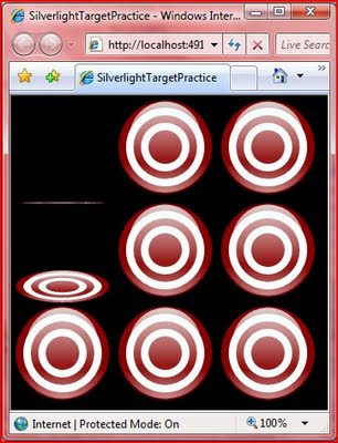
You'll have to run it yourself to see the final result. Here's a screen shot of things in action:
(Click image to enlarge)
Round Up
So, Silverlight 3 allows us to do much more in the XAML than Silverlight 2 allowed. We were able to reproduce the WPF XAML sample with a few changes. I expect that by the time .NET 4.0 and the next version of WPF rolls around, that WPF and Silverlight will look pretty much the same. But we'll still have to wait and see with that.
This is a good example of the power of declarative programming with XAML. The more I use it, the more I like it. When I think about trying to do an application like this in WinForms, I just shudder. It would be a mess of custom drawing code, timers, and crazy calculations. XAML gives me the freedom to easily take control over the layout and appearance of my application. And as we've seen here, it's not just limited to "look and feel", we can also program quite a bit of functionality with it.
You can add some code-behind and create a full fledged shooting gallery game that keeps track of scores and gives you a time limit. But I'll leave that as an exercise for the reader.
Happy coding!
No comments:
Post a Comment