This time we'll be looking at a few of the points from my last post: What I Like About WPF. I set out to create a short demo that uses only XAML (with no code behind) to show the power of some of the features; specifically declarative programming, templates, styles and "lookless" controls. So, let's get to the scenario.
[Editor's Note 06/2013: This example is simply some cool stuff about XAML. If you want to see a more complete example of a button control template (including a ContentPresenter), please refer to Metrocizing XAML: Part 2 - Control Templates.]
Scenario
We'll be creating a very simple shooting gallery-type application. I call it "Target Practice" since it will require some more work to turn it into an actual game. In the final version, we will have a 3 x 3 grid of targets. Each of these is clickable and will result in a "hit" animation. After 3 seconds, the target will reset to its previous state -- all inside the XAML. You can scroll down to the bottom to see the finished product.
Source code for this sample is available here: http://www.jeremybytes.com/Downloads.aspx#TPW.
Step 1 - Application Set-up
We'll start by creating a new WPF application. I'm using Visual Studio 2008, but everything I'm doing here should work in 2005 as well. Create a new project by selecting File -> New -> Project. From there, choose the "Windows" category under "Visual C#" and select "WPF Application".
In the new application, you will find a "Window1.xaml" file. That's where we are going to start. Open up the xaml file, and you will see a designer and xaml editor. We'll be focusing on the xaml editor. Here's what the project template creates:
(Click images to enlarge)
We're going to make a few changes. Again, this isn't a tutorial on XAML, we're just focusing on showing some of the power. Resources from the previous post are helpful if you are completely new to XAML. First thing we'll do is change a few properties in the "Window" tag. Set the following properties:
Title="Target Practice"
Height="370"
Width="350"
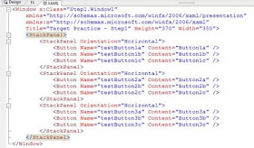
Next, we'll replace the Grid with a set of nested StackPanels. The nested StackPanels will set up our 3 x 3 grid (I could have used the Grid here as well, but the StackPanels are better at letting things "flow"). Inside each nested StackPanel, I have placed 3 buttons. The StackPanel code (that replaces the Grid) looks like this:
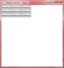
When you run the application, you will get a highly exciting result that looks like this:
Step 2 - Templates & Styles
So, we have a grid of buttons; now what? Next, we are going to take advantage of the "lookless" controls. WPF controls do not have any inherent visual styling to them. They simply use a default template that is provided by the framework. We are going to replace that template with our own to create a custom button. And hopefully, by the time we get done, you'll see how much easier this is to do in WPF than it is in other UI technologies.
We're going to add a local resource to the file. Add a tag "Window.Resources" just above the outer StackPanel. You'll find that Visual Studio IntelliSense is very helpful when hand-editing XAML. There are visual ways of doing this with Expression Blend, but that's another topic. Inside the Resources section, we'll add a ControlTemplate.
A few key things to point out. The TargetType is set to Button. This means that we can apply this template to button controls (and only to buttons). Next is x:Key: this gives a name to the template that we can use elsewhere. Next we have a Canvas (basically our drawing surface) and an Ellipse (which is just a DarkRed circle). Note: this is called the "Outer Red Stripe" in the comments because we will be adding more to this later on.
From here we are going to add a Style. The reason for adding a Style will become apparent as we move along. For now, you can see that we create a new Style, give it some Margins, and then set the Template property to our ControlTemplate:
Styles work by using Setters. The Setters let you select a property (such as Template) and then assign a value to it. You'll notice the syntax for the Template setter looks like this: Value="{StaticResource targetButton}". The curly braces denote that we aren't setting the value directly; we are binding to another object, in this case a StaticResource. The "targetButton" is the x:Key that we specified on our ControlTemplate above.
One thing to note on our Style: we would normally use an x:Key here as well, which would give us a named style that we can apply in our UI. Styles have the special behavior that if you exclude the x:Key, then the style will automatically be applied to every control in that scope. In this case, since the TargetType is Button, it will be applied to every button in our Window. Here's what our application looks like now.
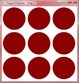
One thing to note: the red circles are still buttons. They are clickable (although they don't visually change when you click on them), and they have standard button events (such as Click). Notice that they do not have any content (Button1a, Button1b, etc.). This is because our template does not contain an element for the Content. If you are creating your own buttons, then you will want to look at this and other behaviors (such as having different visuals for up, down, and hover). So far the visuals for our application aren't that great. Step 3 is going to change that.
Step 3 - Eye Candy
Now we'll take our boring red circles and make them into glassy 3-D buttons. The best way to learn how to do this is to take a look at some Photoshop tutorials and use the same techniques in Expression Blend. The cool part about using Blend is that when you have what you want, you can simply copy the XAML (or have it included as a resource in your project). I am not a graphic designer, and I will admit to stealing this "top glow" and "bottom glow" sections from a demo by Walt Ritscher. He is also a good resource for WPF styles and templates.
First, the top glow. This is simply added to our ControlTemplate below the DarkRed Ellipse. All it is is an ellipse with a radial gradient that moves from white to transparent.
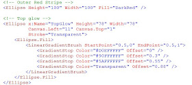
The bottom glow is much the same: just an ellipse with a radial gradient.
What you see when you run the application is a distinct difference in what we had before:
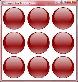
Pretty cool, eh?
Step 4 - Completing the Targets
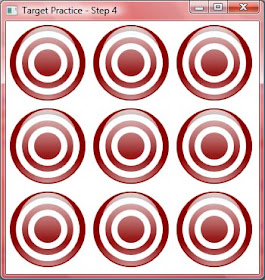
Next, we just need to complete the visual design of our Targets. This is just a set of ellipses, each smaller than the last, alternating Red and White.
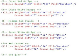
A few things to note here. You'll see that we are moving the Canvas.Left and Canvas.Top properties because the Top Left corner is considered the starting point for drawing. We are moving down a bit and to the right to make a smaller circle on top of the previous one.
Order is important here. The XAML parser processes items in the order that they appear in the file. This means that the "Outer Red Stripe" (our first circle) needs to be specified first, and then as each smaller circle is defined, the XAML parser layers it on top of the last. If we were to reverse the order, then the large circle would simply cover everything underneath it. The same is true for the "glows." We want those as the top layer, so we specify them last in the XAML.
On a side note: Silverlight has a Canvas.ZIndex property that allows you to explicitly set the order of the layering. This is not available in the current version of WPF, but we'll see what the future holds when .NET 4.0 comes out later this year.
When we're done, our targets will look like this:
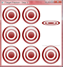
Step 5 - The Action
The last step is to add the behavior. As a reminder, when we click on a Target, we want it to animate to fall over, and then reset after 3 seconds. The animation will work by using a Transform. The first step is to define an empty Transform in our Style (note: we are adding this to the Style, not the ControlTemplate).
Next, we will add a Trigger to our Style. A Trigger denotes a change to a style based on some external influence. In our case it will be a response to a Button.Click, but it could be a MouseOver or other event.
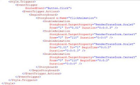
This is a big bit of code, so let's walk through it. First, we are setting up a Triggers section in our Style. Next we are setting up a EventTrigger on the "Button.Click" RoutedEvent. Inside the EventTrigger, we have an Action section which will contain our actual animation. The EventTrigger and corresponding animation is why we need to use a Style here (as opposed to using just the ControlTemplate).
The animation is declared with Storyboards. This is another section where using Expression Blend is helpful. You can define an animation using visual tools, and then copy the XAML back into your application (or use it directly as a Resource).
The first "DoubleAnimation" on "RenderTansform.ScaleY" means that we will be changing the "Y" scale (meaning the Height) over the duration specified (0.3 seconds) and changing it from 1 (full height) to 0.01 (which ends up looking like a line on the screen). If we were to use this animation by itself, then our button would actually shrink "up" because the origin is at the top left corner. In order to get it to shrink "down", we need to add another transform.
The second "DoubleAnimation" on "RenderTransform.CenterY" means that we will be moving the origin of our button. This time from 0 (the top) to 110 (which is actually a little bit below the bottom of our 100 unit Canvas -- the Canvas is a special container in that you can actually draw outside of its boundaries).
Let's take a step back for a moment and talk about animation. What you will notice is that we do not have any timers specified here. To perform this animation in the WinForms world, we would use a timer, and then perform some action on every tick (such as moving an image a few pixels). Animation in XAML is declarative. This means that we tell it what we want to do (move from here to there and take 0.3 seconds to do it) and not how to do it (move 3 pixels each 100 milliseconds). The animation declaration itself is just changing a Property on the element. In this case, we are making changes to the empty RenderTransform that we defined earlier. The "DoubleAnimation" denotes that we are changing a Property that is of type Double (specifically the RenderTransfor.ScaleY and RenderTransform.CenterY).
These two animations together will result in our Target being "hit" and falling down.
The next 2 "DoubleAnimations" are basically doing the opposite. Note that these both have a BeginTime of "0:0:3", which means that this section of the animation will start after 3 seconds have elapsed. This will return our Target to the upright position after 3 seconds.
You'll have to run it yourself to see the final result. Here's a screen shot of things in action:
Round Up
So, what we've seen here is a pretty impressive application for not having any C# code. In fact, we could have started with a VB project and come up with exactly the same results. We were able to declaratively program the behavior using XAML only -- and all in less than 120 lines. We took advantage of the lookless controls by replacing the default template and style with our own. With a little bit of C# code, we could turn this into a full fledged Shooting Gallery. But I'll leave that to you.
Happy coding!
Monday, March 9, 2009
Sunday, March 1, 2009
What I Like About WPF
Windows Presentation Foundation (WPF) is the future of Rich Client (or Smart Client or Fat Client or whatever term is in fashion) programming in .NET. Microsoft is using WPF for the UI in Visual Studio 2010. If you are like me, then you still haven't had a chance to work with it extensively (due to constraints of my day-job). But, if you are like me, you are also very excited about the technology -- and not just because of the eye candy (although that is an added bonus; albeit a potentially dangerous one).
Note: this isn't an introduction to WPF. I have some resources listed below if you want more info. So, here's what I like...
Declarative Programming Model
You can do quite a bit of the UI work in the XAML itself (XAML stands for eXtensible Application Markup Lanuage -- for more information, look for an intro to XAML). This UI work includes triggers, animations, and data bindings. Sure, you can do the work in your C# (or VB) code, but it's nice to be able to put it into the XAML.
Data Binding
I write business applications for a living -- that means pretty much everything requires some sort of data access. There are several WPF data binding features that seem to combine the best of WinForms data binding and ASP.NET WebForms data binding, plus some new features thrown in.
Binding to the container
Since you can bind the DataContext (your data source) to a UI container (which is pretty much everything -- see below), every child element can use that DataContext implicitly.
Good Support for value converters
IValueConverter is nothing new, but I have seen several WPF demos that use it in the data binding, making things dead simple. For example, you can use a value converter to convert a bank balance (an integer) to a brush (red for negative values, black for positive). In your bindings, you can bind the Brush on a TextBox directly to the bank balance, and the value converter takes care of the rest.
Binding to static resources
You can use data binding syntax to connect properties to static resources that are either defined locally to the page or globally to the application. As a programmer, you need to do less internal context switching since the syntax is the same regardless of whether you are binding to a static resource or a dynamic data context.
Binding from one element property to another
I'm not sure why I like this so much, but for some reason I do. If you need to display the same data twice on a page (like in a master / detail or selection / detail relationship), you can bind the Content property of one element ot the Content property (or any other property) of another.
Commands
Coming from the Delphi programming world, I always wondered where the concept of Actions went in C# (after all, Anders Heilsberg was the architect of both languages). Commands allow you to hook up several UI elements to the same command. For example, you can hook up a menu item, tool bar item, and a button to a single Command (such as Save). This lets you enable or disable the Command, and it will affect all connected UI elements. (Also, you have centralized code which is always good.)
Now let's move on to some more visual features. (I'm skipping the eye-candy at this point to focus on usability.)
Most controls are also containers
This adds immense flexibility to the UI designer. You have full control over layout of a button that has both an image and text. Anyone who has fought with the layout of an image button in WinForms will greatly appreciate this.
Flexible layout and resolution independence
If you pay attention to your layout, you can design an UI that is usable on both a 23" desktop monitor and a 9" netbook. This will seem somewhat familiar to web developers. Plus, if you focus on using vector graphics (as opposed to bitmaps), then you can get good scaling without aliasing (i.e. "jaggies").
Templates and styles
This seems very comfortable to web developers who use CSS. But it is incredibly more powerful. I'll be focusing on this in a future post.
"Lookless" controls
None of the WPF UI controls have a built in rendering. Instead, they have default templates. This means you can replace the default with your own template to make a control appear however you want. Because the base control is "lookless", it means that all of the functionality (such as "Click" on a button) is separated from the rendering; so, you can replace the visual rendering without impacting the underlying functionality.
Lack of a DataGrid
This one may sound weird. Most of the WPF forums are littered with developers complaining about the lack of a data grid. There is even a CodePlex project to implement one. But I have found the lack of a DataGrid to be an opportunity.
In my applications, I generally use data grids because they are easy -- not because they are the best way to present the information to the user. I have started to think about the power of the ListView. By using containers and templates (including data templates), I have full control over how I present the data, and it's dead simple.
"Dead simple" is the key. Most of the things that I've mentioned are possible to do in WinForms, but you end up jumping through hoops to accomplish them. WPF makes these things "dead simple." If you're curious about alternatives to displaying data (without a Data Grid), then check out some of Billy Hollis' web casts (see below for links).
So, that's why I am excited about WPF. If you are, too, then you can check out these resources:
The Official Microsoft WPF and Windows Forms Site
This site is loaded with tutorials, samples, downloads, and lots of info.
dnrTV
This site has web casts (generally about an hour long) on all sorts of .NET topics. As mentioned above, Billy Hollis has done some excellent episodes:
dnrTV - Episode 115 - Billy Hollis: Getting Smart with WPF
dnrTV - Episode 128 - Billy Hollis: XAML for Developers Part 1
dnrTV - Episode 129 - Billy Hollis: XAML for Developers Part 2
Pro WPF in C# 2008: Windows Presentation Foundation with .NET 3.5, Second Edition - Matthew MacDonald
This is an excellent (large) book. It's around 1000 pages, and has lots of great information and samples. There is also a VB version of this book if that is your language of choice.
I'll be digging in to specific WPF topics as time goes on, so stay tuned!